Back in March, Mazda became one of the last major car manufacturers to announce launch plans for CarPlay support. Mazda's first announced vehicle with CarPlay is the 2018 Mazda6, with owners of Touring trim and above able to bring their vehicles to a Mazda dealer for a free upgrade starting this month. CarPlay will be available pre-installed in Mazda6 vehicles with Touring trim and above as of November, while Mazda's 2019 CX-9 is also just starting to roll out with CarPlay available pre-installed.
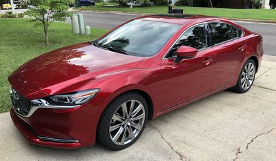
While the general CarPlay experience is consistent across car brands, as it's driven by your connected iPhone, there are some differences in how CarPlay interfaces with manufacturers' various infotainment systems and hardware, so it's worth taking a look at the CarPlay experience in a Mazda. I've had a chance to spend some time with a CarPlay-equipped 2018 Mazda6 Signature, and CarPlay is a welcome alternative to the built-in Mazda Connect infotainment system that has garnered mixed reviews over the years.
Mazda Connect
Before we touch on CarPlay, it pays to take a look at Mazda Connect, as that's the software and hardware CarPlay sits on top of. Mazda has opted for multiple control options in its vehicles, with both an 8-inch touchscreen on the dashboard and a commander knob with associated buttons on the center console. A smaller dial next to the commander knob lets you adjust volume without reaching up to the dashboard, or you can adjust the volume from the steering wheel. Voice control through a button on the steering wheel is also available.
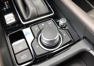
Touchscreen operation is unsurprisingly straightforward, while the commander knob offers a flexible array of input methods including twisting, rocking, and pressing the knob to navigate around. The cluster of buttons around the knob lets you jump quickly to navigation, music, favorites, the Mazda Connect home screen (or CarPlay home screen if active), or back to the previous screen. Navigating the interface with the commander knob can be a bit clunky at times, particularly if you have to navigate through several menu levels, but overall it's a satisfactory experience similar to that offered by a number of other manufacturers.
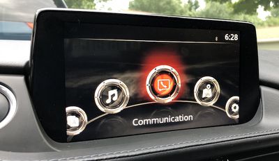
One important thing to note is that while the Mazda Connect system includes a touchscreen, it's locked out while driving in order to reduce distractions, requiring you to use the commander knob or voice to control the system. (The lockout is only while the car is in motion, so the touchscreen does work while stopped at a stoplight, for example.) Mazda is one of the most conservative carmakers in this regard, but forcing users to the commander knob can actually be a detriment in some cases where reaching over to the display for a quick tap would likely be less distracting than using the knob to scroll over to the desired option.
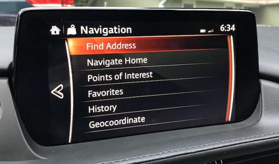
A significant part of what makes CarPlay such a welcome addition is that Mazda Connect has a few shortcomings. I found overall navigation of the interface passable but a bit clunky with the commander knob. The user interface layout is decent enough for touchscreen control, but when you're forced to use the commander knob it can be something of a chore to navigate through the options.
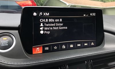
The overall look of Mazda Connect isn't bad by car infotainment standards, although it could certainly stand to see some modernization, and there are some curious design decisions such as not allowing enough characters to display song titles completely. With a nice, big 8-inch screen, it shouldn't be the case that song titles are routinely cut off.
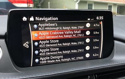
Built-in navigation through Mazda Connect also leaves a bit to be desired, as I found the system unable to parse some of the destinations I tried to input by voice and the POI database seemed rather weak, making it difficult to find some destinations.
In one test trip, the onboard GPS tracking seemed to be improperly calibrated, and navigation was useless as the map continually showed me driving off into the woods. On all other trips, however, the GPS location and directions were accurate, so the problem I experienced may have just been a one-off bug. It's also an issue I've occasionally seen with my iPhone, so maybe there isn't really that much difference in performance here.
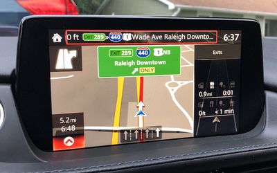
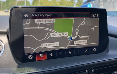
Otherwise, the navigation system performed well with helpful turn-by-turn directions and depictions of road signs at major junctions. A handy optional feature also displays cross streets as you approach you them, even if you don't have a navigation route running. Another helpful view displays along the right side of the screen which amenities like gas, food, and auto repair are available at upcoming exits.
Mazda Connect also isn't known for being speedy, with the most significant chokepoint being at initial boot. Upon starting the car, it took 15 to as much as 40 seconds for Mazda Connect to boot up, display a warning to keep your eyes on the road, and become available to use. Loading directly into navigation can take a few seconds longer. It doesn't necessarily sound like a huge amount of time, but when you just want to hop in your car and go it can feel like an eternity. Unfortunately, CarPlay doesn't help with this, as Mazda Connect has to fully boot up before CarPlay can be recognized as available, so you still have to wait.
CarPlay
Once you're into CarPlay, things work mostly as expected. All of the familiar CarPlay apps are there, and you can navigate through them by touch (with one big caveat discussed below), the commander knob/buttons, or voice.
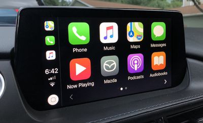
One important difference for Mazda is that the touchscreen lockout while driving also extends to CarPlay, which means you'll need to use the commander knob to scroll through highlighted user interface elements. It's an officially supported input method for CarPlay, but ultimately it's less convenient for an operating system that's designed to be manipulated by touch with minimal distraction.
Touchscreen input works fine with CarPlay when the car isn't in motion, so it's simplest to get as much set up for your drive as you can before you set out and make adjustments at stoplights. Commander knob ease of use will obviously improve as you spend time using it and muscle memory takes over for some tasks, but it's rarely going to be as convenient as a direct touch interface.
While the commander knob can be a little inconvenient for navigating the user interface, some frequently used functions like play/pause (press the knob) and back/forward (rock the knob) are simple and intuitive. It's the more complicated operations that involve scrolling through various UI elements to make a selection that are more cumbersome to accomplish with the knob than a touchscreen tap.
As with the touchscreen lockout for Mazda Connect, Mazda tells me the extension to CarPlay is a "conscious choice" based on its feeling that the knob is less distractive than using a touchscreen while the car is motion. I'm not sure I necessarily agree when it comes to CarPlay, as Apple has put considerable thought into keeping the interface simple enough that you can grab relevant information at a glance and quickly tap what you need.
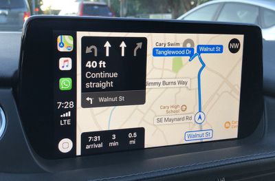
Beyond the knob itself, the associated hardware buttons surrounding it do come in handy for CarPlay. The navigation and music buttons make it easy to jump back and forth between frequently used screens, and it hops in and out of CarPlay as needed – such as when you have Apple Maps active while listening to XM radio and the buttons correctly take you to the proper music and maps apps. The system also remembers if CarPlay is active when you turn off the car, and takes you back to it when you start up again.
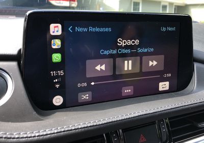
One other thing to note is that if your phone is plugged into the car, pressing the talk button on the steering wheel appears to only activate Siri. I was unable to find a way to activate the Mazda Connect voice system while the phone was plugged in, even if CarPlay wasn't necessarily active.
Some systems like BMW's offer dual access via the talk button, bringing up Siri with a short press or the onboard system with a long press. Mazda tells me it decided not to offer dual access because its research concluded that customers found it confusing. Changing terrestrial/satellite radio stations is the only thing Mazda Connect's voice system can do that Siri can not, and that task can also be accomplished in some regard by using buttons on the steering wheel.
Ports and Connectivity
Mazda has been thoughtful with the placement of various ports, helping to keep cords and devices tucked away. Two USB ports (one designated for connecting a phone to Mazda Connect), an Aux port, an SD card slot used for loading maps into the onboard navigation system, and a 12V power port are all hidden away in the center console compartment.
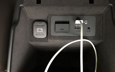
The compartment isn't particularly roomy, as the gearshift, commander knob, and cupholders take up much of the console space, but it lets you keep your phone out of sight. If you prefer to have your phone in a cupholder or the storage tray at the front of the console, there's a sufficient gap on either side of the console compartment lid to easily run the cable out without pinching it.
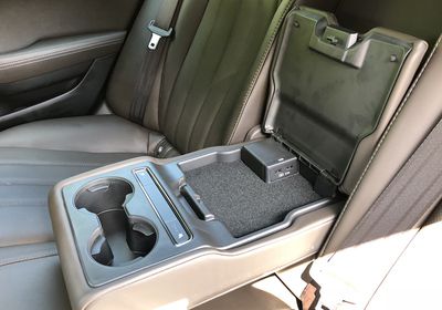
In the rear, the middle seatback folds down to offer a pair of cupholders, controls for heated seats (if equipped), and a shallow storage compartment housing a pair of 2.1A USB ports, which is great for keeping the kids' iPads charged up. Mazda does not, however, offer a Wi-Fi hotspot option to keep those devices connected to the internet.
Wrap-up
With CarPlay adoption growing rapidly over the past several years, it's become more of a must-have feature for car buyers, so it's great to see Mazda finally get on board with the technology. I know several Mazda owners who have been waiting patiently for CarPlay support, and while it's unfortunate there are no signs yet of retrofit availability beyond the current Mazda6, at least those loyal Mazda owners can look forward to it in their next car.
Infotainment systems from car manufacturers across the board are notorious for design and performance that don't reach the level of polish we've come to expect from our smartphones, and Mazda Connect is no different here. The whole Mazda Connect system could use a refresh to modernize the look and improve performance, but once you get familiar with the operation it's a decent system beyond the issues I had with navigation.
Of course, any shortcomings in onboard systems like Mazda Connect serve to increase the value of CarPlay support, which lets you use the apps you're already familiar with right on the dashboard and have all of your contacts, music playlists, maps history, and more at your fingertips without needing to rely on incomplete and sometimes cumbersome syncing of data to built-in car systems or audio-only connections over Bluetooth or Aux. And with CarPlay expanding to support third-party maps apps like Google Maps and Waze, even more iPhone owners may be willing to become regular CarPlay users.
The 2018 Mazda6 and the new 2019 CX-9 will be the first Mazdas to get CarPlay support, but it's reasonable to expect that the rest of the lineup should get it as the new model years are introduced. Unlike some other manufacturers, Mazda isn't charging extra for CarPlay, so far simply bundling it into all tiers above the entry-level Sport trim. The company has not, however, announced any plans to offer retrofit CarPlay support on any models other than the 2018 Mazda6 that's currently in the middle of its production year.
The 2018 Mazda6 starts at an MSRP of $21,950, although the minimum Touring trim required for CarPlay begins at $25,700. The new 2019 CX-9 starts at $32,280, with the Touring trim beginning at $35,330 needed for CarPlay.













Top Rated Comments
You can see it in the image in the article showing Apple Maps on CarPlay in action - approximately 2/3 of the screen is covered in stuff that isn't the map.
You've got a lot of space taken up by other app icons, a home button, various status icons and a clock. Those app icons definitely aren't necessary - the home button is sufficient for getting to other apps. Which - why is that button there at all? Your phone already has a physical home button that does the same thing. And your car probably has a dedicated button that does it, too. Clock is good. The status icons are redundant - why do you need to know both your cellular signal and your wifi signal at the same time?
Then there's a very large box showing you what's up next, but despite how large the box is, the text in the box is too large for it and it's forced to wrap awkwardly. End result is that about half of the large black box is simply empty space that covers up your maps.
Then there's another box with a few more stats. This is fine and useful information, but it's presented in a weird spot that could otherwise have map in it. I'd recommend moving them to where all the app icons are.
Same deal with the compass - fine and useful info, but awkwardly taking a chunk out of map space. It should be in the top left, where the map icon in the image is (which, I didn't realize this before - why the heck is there a button for switching to the map app when you're already in the map app? That's the ultimate in totally wasted space.)
That's the extent of what is visible in this screenshot, but the UI is actually worse (if you can believe it.) When you get a text message, what happens? An enormous black box covers the top half of the screen for the next several seconds, blocking out the lane guidance and next steps, plus the map showing you what those next steps are. That box doesn't contain your message in it - it just tells you who sent it and nothing else.
Oh, you have a passenger in the car who wants to use your phone - perhaps to change which song is playing or to respond to a text message for you? Your maps go away when they do that.
There's some other negatives I could bring up about it. The only pro I can think of is it's nice that you can type in stuff on your phone instead of on a crummy car touch screen, but really, you have the same thing going for you if you just mount your phone in front of that touch screen.
Is this an improvement over other built-in systems? Maybe in theory? In practice? CarPlay is a total dumpster fire. I think it's a real testament to how incredibly bad the built-in systems are that people want CarPlay instead of it.
To be clear, Touring is the second-lowest of five trims on the Mazda6. Only the base Sport trim doesn't get it.