The new Mac mini will launch in stores and begin arriving to customers this Friday. Ahead of time, the first reviews of Apple's latest redesigned computer have been shared by select media outlets and YouTube channels.
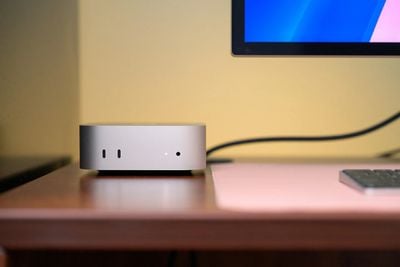 Image via The Verge
The Mac mini received its first redesign in over a decade this year, introducing a considerably smaller casing and two USB-C ports on the front of the enclosure. The Verge's Chris Welch:
Every time I glance over at the new Mac Mini on my desk, it feels like the Mini's ideal form. The redesigned enclosure makes the most of Apple Silicon's small footprint, and with Apple's M4 chip and an ample selection of ports, the 2024 Mini should remain a zippy, reliable computer for years to come. It's never been more mighty.
The M4 Pro version of the new Mac mini also supports Thunderbolt 5 connectivity, with a total of three type-C ports on the rear. WIRED's Brenda Stoylar on the new design and ports:
A lot of people compared the Mac Mini's new look to an Apple TV box, but I think it looks more like a mini Mac Studio—especially with the new port arrangement. Apple finally added ports to the front (a gripe I had with the M2-powered version), which means I can spend less time annoyingly reaching over to the back to plug a cable in.
The M4 model comes with two USB-C ports that support USB 3.0 and a 3.5-mm headphone jack. The other side has three Thunderbolt 4 ports (the M4 Pro variant has three Thunderbolt 5 USB-C ports for the first time ever) along with an HDMI, an Ethernet connection, and a power port. It marks an official end to the USB-A port on a Mac Mini.
Reviewers also commented on the location of the power button, which is now placed on the bottom of the device rather than the rear. Stoylar added:
Ports on the front are great. Moving the power button to the bottom? Not so much. It used to be on the back, but this new implementation isn't intuitive. I have to pick the device up and press the button to power on my desktop. It's just weird. You'll probably leave this thing on all the time but, like the USB-C port on the underside of the Magic Mouse, it's just an awkward design choice.
The Verge's Chris Welch on the new Mac mini's relocated power button:
...Apple made the curious decision to move it to the bottom of the machine near the rear left corner. Do I wish the button were someplace else? Sure. Pressing it requires reaching over the Mini and lifting the unit up slightly. It’s silly but hasn't negatively affected my experience in any material way. If you've got an Apple Magic Keyboard with Touch ID, you’ll be reminded of its awkward location right during setup, when you've got to double-press the power button to make a secure link between the fingerprint sensor and Mac. The Mini is used in a wide mix of environments including home theater systems and live event production. I could see the button's position becoming a hassle in some of those scenarios, but if you're using it on a desk, it's more of a strange quirk than an annoyance.
The new Mac mini is powered by Apple's M4 and M4 Pro chips, which are up to 25% and 45% faster than their predecessors. As of the time of writing, higher-end Mac mini configurations with the M4 Pro chip (14-core CPU) receive a multi-core Geekbench score of 22,094 (average of 11 results), compared to an average of 14,480 for the previous Mac mini with the highest-end M2 Pro chip. Engadget's Devindra Hardawar on the Mac mini's performance:
Outside of benchmarks, the Mac mini impressed me by running Lies of P in 1,440p with maxed out graphics settings at 60fps. It even managed to run the game in 4K with medium graphics settings, but the frame rate hovered around 30fps, which wasn't very playable. That's not a huge surprise though — what's more important is that I know the GPU is powerful enough to run modern games at more reasonable resolutions. Resident Evil 4 and No Man's Sky also held a steady 60 fps in 1,440p.
To test out the Mac mini's AI capabilities, I used the Whisper Transcription app to transcribe an hour and nine-minute long episode of the Engadget Podcast. That took two minutes and nine seconds, using the small language model. In comparison, the M4-powered 14-inch MacBook Pro took three minutes and three seconds, while an M3 14-inch MacBook Pro took three minutes and thirty-seven seconds. These figures tell us Apple's M4 hardware can help students quickly get notes from lecture recordings, or even transcribe classes in real-time without much effort.
The M4 series of chips also brings an updated GPU architecture with improved efficiency, hardware-accelerated ray-tracing, support for AV1 decode, up to 64GB of LPDDR5X memory, dynamic caching, and a much more powerful Neural Engine to the Mac mini. The new Mac mini's thermal design was also highlighted by reviewers, with Welch adding:
Apple's revamped thermal system for the Mini keeps the M4 model running quietly. Even when I'm deep in a Lightroom photo editing session, I don't hear the fan. I'm certain the M4 Pro's extra GPU cores would make those RAW edits even faster, but the regular M4 is up to the task for most photo work. Elsewhere, the machine has rarely missed a step, no matter what I throw at it. I'm no videographer, so I can't speak to whether serious editing work would expose the M4’s limits. If there's one use case that warrants stepping up to the M4 Pro, it's likely that.
TechCrunch's Brian Heater concluded that the new Mac mini is well designed, but without a clear target customer:
The new Mac Mini is a case of a (mostly) well designed machine without an entirely clear market segment. Its sweet spot is those who already have a monitor or monitors and are just looking to upgrade their system with the newest entry-level Mac. I would toss in those who want to pick out their own monitor, but don't want to invest in the Studio and don't particularly care about the freedom a laptop brings. Or maybe the platonic ideal is someone who wants a quick, easy, and (relatively) cheap desktop to supplement it — without the built-in limitations of an all-in-one iMac.
If any of the above rings true, by all means, go small. There’s little that's inherently bad about the machine (the power button is more annoying than bad), but it’s not entirely clear where it stands in the Apple desktop lineup, with the Studio and iMac flanking it on either side.
I can't tell you for sure how large that segment of the market is at present, but I suspect the system is most purchased in the enterprise. It’s easy to image companies buying these up in bulk. For consumers who are on the fence, consider whether a MacBook or iMac makes more sense for your setup and pocketbook.















Top Rated Comments
(obviously once you spec it up, any "value play" quickly evaporates)
The appeal of the Mac Pro and older Laptop was the ability to easily upgrade internal components such as RAM and SSD and GPU. But now everything is soldered on and non upgradable!
So now I'm no longer a Mac Pro customer nor a Mac Studio.
I'm Mac Mini customer who will spec out M4 Pro with extra RAM and base SSD simply for the OS and apps and a 10GBe network port.
All the money I would have spent with Apple on their PRO gear is going on Synology NAS and networking instead.