The new iPad Pro with the M2 chip will start arriving to customers and launch in stores on Wednesday, October 26. Ahead of time, the first reviews of the new iPad Pro have now been shared by select media publications and YouTube channels.

Key new features for the 11-inch and 12.9-inch iPad Pro include the M2 chip, Wi-Fi 6E support, new hover functionality for the Apple Pencil, and support for ProRes video recording. The device also has Smart HDR 4 and supports Bluetooth 5.3.
We have rounded up both written and video reviews of the new iPad Pro below.
Written Reviews
The new iPad Pro is able to detect the second-generation Apple Pencil while it hovers up to 12mm above the display, allowing users to see a preview of their drawing before they make it. Federico Viticci at MacStories called the feature a "very nice surprise," as he found it useful for interacting with iPadOS as a whole:
I'm here to tell you, however, that Apple Pencil Hover goes beyond enhancing the typical iPad drawing experience: it's also a neat way to control the iPadOS UI, adding a new dimension to touch interactions. I was not expecting to use Apple Pencil Hover at all because I'm no artist; its native integration with interface elements across the system turned out to be one of my favorite additions to iPadOS this year – definitely more so than Stage Manager.
For example, Viticci said Apple Pencil hover can be used to preview and scrub through videos on the YouTube website in Safari.
Jason Snell of Six Colors expressed disappointment that the iPad Pro still has a 2018 design and said the device would benefit from some features that the new 10th-generation iPad received, such as a landscape FaceTime camera and a Magic Keyboard with function keys:
That makes the fourth revision for this design without any substantial exterior changes. It's a good design, yes, but it's a little frustrating that it's been in stasis for four full years. The 10th-generation iPad's repositioned FaceTime camera would be welcome on a new iPad Pro. A revised version of the Magic Keyboard introduced in April 2020 with that extra row of function keys like the Magic Keyboard Folio would also be nice.
But while the low-end iPad points the direction to the future, the M2 iPad Pro remains in stasis. The display is unchanged from the M1 generation, meaning only the 12.9-inch model gets the excellent Liquid Retina XDR display, and the 11-inch model remains left out. There are several iPads available at the 11-inch size, so it would be nice if the iPad Pro were a bit better differentiated from (for example) the iPad Air. It's not.
Apple says the new iPad Pro has up to 15% faster CPU performance and up to 35% faster GPU performance compared to the previous model with the M1 chip. Engadget's Nathan Ingraham said the 12.9-inch iPad Pro with the M2 chip was "far more responsive" in his initial testing than his 11-inch iPad Pro with the A12Z chip from 2020:
In the short time that I've been testing the latest 12.9-inch iPad Pro, I can say that it's far more responsive than my personal 11-inch iPad Pro from 2020 as well as the new iPad I've also been testing. Those other devices aren't slow by any stretch of the imagination, but the M2-powered iPad Pro responds to everything almost instantaneously. Of course, the same can be said about the M1 iPad Pro, especially given my modest workflow.
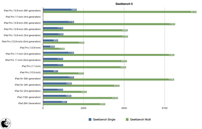
Mac Otakara shared Geekbench 5 results for the new iPad Pro that confirm about a 15-16% increase in multi-core performance over the previous model (8,516 score for 12.9-inch model with M2 chip vs. 7,326 for the 12.9-inch model with M1 chip):
Mashable's Stan Schroeder said iPadOS 16's new Stage Manager feature remains "buggy" on the new iPad Pro and is "far from perfect":
Stage Manager was also buggy. For example, invoking it with the Keyboard's trackpad, which you do by moving the cursor to the left of the display, occasionally wouldn't work. Some apps, including Facebook and Apple's own Weather (which is new to the iPad) would sometimes look messy when resized inside Stage Manager. Having the app windows stubbornly cling to a certain size when you need them to be just a little bit bigger or smaller is annoying. I do think it's better than both Slide Over and Split View as a multitasking tool, but it's still far from perfect.









Top Rated Comments