Awhile back, I took at look at the new infotainment system being rolled out by Toyota and Lexus, spending some time with the Lexus version of the system in the 2022 NX. I've now had a chance to explore the Toyota version of the system optimized for a more heavy-duty vehicle in the form of the 2022 Tundra pickup.
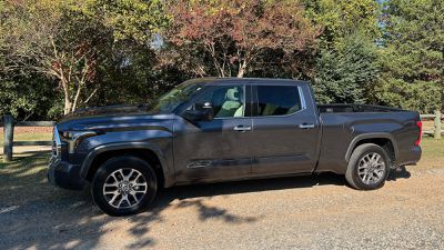
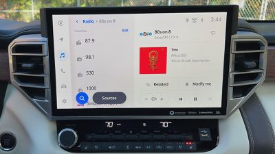
Like the Lexus NX, the Toyota Tundra comes with an optional 14-inch screen that was included in the 1794 trim I was able to test. But rather than having to dedicate a significant portion of the display to software climate controls as in the NX, the Tundra turns its entire screen over to infotainment purposes while offering more traditional hardware climate controls below the screen.
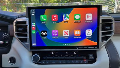
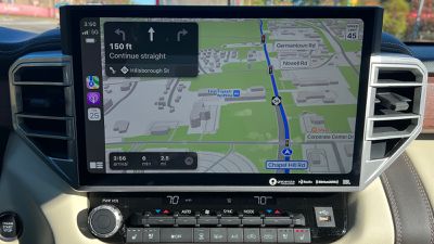
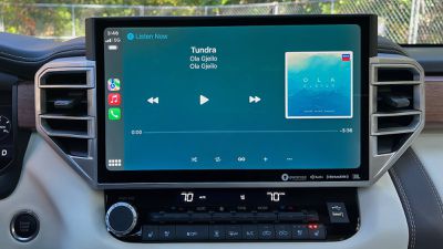
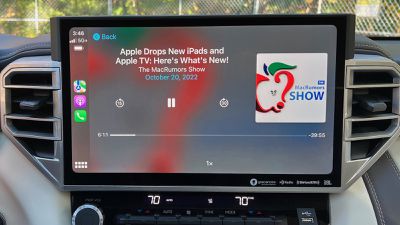
The result is an absolutely massive palette for infotainment, which includes wireless CarPlay. Rather than the relatively extreme widescreen layout of CarPlay on the NX, the Tundra offers a bit more traditional aspect ratio, although the large size and high resolution of the Tundra's screen means CarPlay is still able to be displayed in an information-rich layout with two rows of five icons on the Home Screen, expansive views in Maps, and more.
Overall, Toyota's infotainment system delivers bright, crisp graphics and an overall clean look with both dark and light modes depending on preference. As I highlighted in my review of the NX, the new infotainment system forgoes a home screen or dashboard view, limiting views to one function at a time. A small strip along the left side of the screen makes it easy to change between functions like navigation, audio, phone, vehicle controls, settings, and CarPlay (when connected).
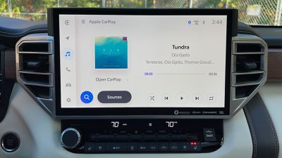
When CarPlay is active, it takes over the entire screen, which is visually pleasing for an immersive CarPlay experience but makes it a bit awkward to switch back to the native system. With as much real estate as there is on the Tundra's infotainment screen, I wish Toyota would have preserved that strip along the left side to be able to quickly access native infotainment functionality.
Toyota is one of an increasing number of automakers to add support for direct streaming of Apple Music content from the native infotainment system. A few other automakers like Porsche and Audi have been rolling this out, and it's nice to see it trickling down to more mainstream brands. Toyota supports direct streaming of Apple Music and Amazon Music content, and while it may seem a bit redundant and unnecessary given that Apple Music can be easily accessed via CarPlay, it doesn't hurt to have options for those who prefer to spend more time in the native system for the features it offers.
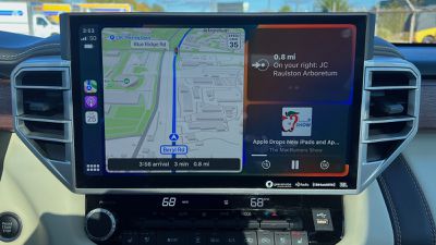
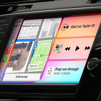
Beyond the main infotainment screen, Toyota's vehicles have also extended CarPlay integration to additional screens like the digital cockpit and head-up display. Audio track information from CarPlay has long been supported on additional screens like these, but it's only over the past year or so that support for Apple Maps navigation prompts has similarly begun rolling out.
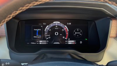 Apple Maps direction on left side of digital cockpit
It's certainly handy for those navigation prompts to appear in the head-up display to limit driver distraction, and putting them in the digital cockpit helps for those times that you've moved away from CarPlay and Apple Maps on the main screen but still want those turn-by-turn directions.
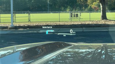 Apple Maps directions in head-up display
My test Tundra came with a wireless phone charger positioned prominently where the console meets the center stack, making it easy to plop your phone down and still have it visible if needed. The charger is a simple angled surface with a cushioned bottom edge where your phone rests and a plastic ridge to help align your phone and keep it from shifting out of place as the vehicle moves.
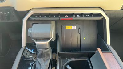
Unfortunately, I ran into some of the same finicky charging issues I had with the NX, despite the charger design being completely different. Charging my iPhone 14 Pro Max with Apple's fairly thin leather case did not work on Toyota's charger, only briefly registering a charge for a few seconds before losing the connection. Even without a case, I couldn't get my phone to charge reliably. An iPhone 13 Pro Max similarly did not work with a case on, but did work well without a case.
It appears that flat charging surfaces like those found in the Tundra and NX are struggling with the increasingly large rear camera bumps on Apple's iPhone models. The bumps prevent the phones from sitting flush against the charging surface, and the gap that results in the area of the charging coils significantly interferes with the ability to maintain a charging connection. Apple and many third-party companies have addressed the issue by embracing MagSafe and MagSafe-compatible solutions that focus on small charging surfaces that only contact the phone in the immediate area of the charging coils, avoiding the camera bumps entirely.
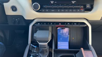
Hopefully it's only a matter of time before car manufacturers start embracing MagSafe-like solutions for wireless charging, as the magnets would offer a number of advantages when it comes to initial alignment and fit between the phone and charger and stability while the vehicle is in motion. That prospect is looking more feasible with the next-generation Qi2 charging standard adopting MagSafe's power profiles and magnetic alignment, meaning car manufacturers will be able to offer a single wireless charger in their vehicles that can magnetically dock various brands of phones.
Not all iPhones support MagSafe and it will take a while before Qi2 spreads throughout the user bases of various brands, so it remains to be seen how things will play out. But for all the promise of a wireless phone experience in the car, the phone charging aspect remains the weakest link in the chain in my experience.
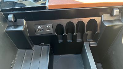 Charge-only USB-A and USB-C ports in center console
If you prefer a wired USB connection, the Tundra offers a number of options for you, although the only data port you'll find for using wired CarPlay is a USB-A port sitting rather prominently on the dashboard, which means your cable will definitely be left dangling. If all you need is charging, you'll find more options throughout the cabin, including a USB-C port and a USB-A port inside the spacious center console compartment and another set of USB-C/USB-A ports for rear passengers on the back of the console. My Tundra also came equipped with a 120V power outlet in that location for larger power needs.
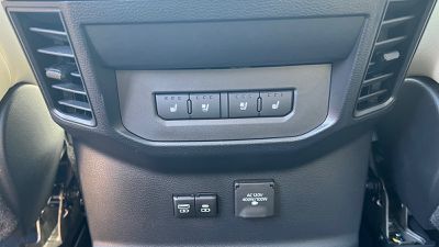 Charge-only USB-A and USB-C for rear passengers
Overall, I really appreciate that the Tundra has maintained hardware climate controls, keeping them intuitive and simple to use largely by feel while also freeing up space on the main display for infotainment uses. Full-screen CarPlay on the 14-inch display is really a treat, though as I mentioned, I would have preferred just a bit of the screen real estate had been held back from CarPlay and used as a control strip for the native system to make it easier to hop around.
One of the advantages of modern infotainment systems is that many of them like Toyota's can receive over-the-air updates to refine them and add new features over time, so hopefully we'll see some tweaks to improve things for users wanting to access both CarPlay and the native system.
As with most pickups, the Tundra is available in a number of trims with various options that span a wide price range. It starts at under $40,000, but that only gets you a much smaller 8-inch Toyota Audio Multimedia infotainment system with no ability to upgrade to the 14-inch screen. In order to get the 14-inch screen, at a minimum you'll need either the SR5 trim with the $9,000 TRD Sport Premium Package or the Limited, both of which push pricing above $50,000. Other features like the head-up display and rear USB ports require even higher-level packages and/or trims.













Top Rated Comments
In other news, I'm amazed how 80's GM-like some of the interior bits look! o_O
Touchscreens in cars...it's just physics...cars are not the same as sitting in a chair at home. Car rides are bumpy and sometimes locating then actually pressing a small tap area on a CarPlay screen is an exercise in repeated tries and frustration. Plus driving a car should require focus on the road ahead, not re-pressing the icon you missed the 1st or 2nd time. The Carplay home screen is fine, for example; large buttons with good spacing. But finding and pressing any tiny "buttons" like the icons on this screen are atrocious for any driver of a moving vehicle.
Physical buttons for primary radio/HVAC controls all the way.
Anyhow, digital cockpits is a huge nope in my book. I drove a car with an all digital cockpit before. The display went dark for 5 minutes and I lost speedometer, tachometer...all the gauges. I had to judge speed by those around me and RPM by engine noise.