The Acura MDX is Honda's luxury-brand three-row SUV, and with the recent launch of the 2022 model, the MDX now supports wireless CarPlay. The MDX is Acura's first vehicle with wireless CarPlay, and I recently had a chance to check out the updated model and some of its new features.

The MDX starts at $47,200, but my test vehicle was equipped Acura's Super Handling All-Wheel Drive, Technology Package, and sporty A-Spec Package, which pushed the sticker price over $57,000. A high-end Advance Package with a few additional features would see the MDX top out at just over $60,000.
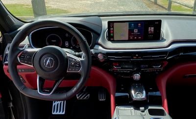
Acura Infotainment System
The Acura infotainment system remains fairly similar to the system I tested in the 2019 version of the RDX, Acura's smaller two-row SUV, although the MDX comes with a slightly larger 12.3-inch main infotainment screen compared to the 10.2-inch screen in the RDX.
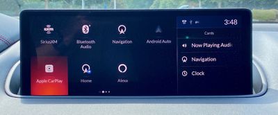
Aside from the size, however, the overall look and control systems are very similar, with the most notable aspect being the lack of a touchscreen. Acura is one of a few brands that has prioritized putting the main infotainment screen fairly high on the dashboard and set back rather far from the driver.
This keeps the screen closer to the driver's line of sight and helps limit the amount of time the driver needs to take their eyes off the road when glancing at the screen. But it also means that it's not feasible to operate the system by directly touching the screen.
True Touchpad Interface
Acura's solution to the lack of a touchscreen is its True Touchpad Interface, a fairly small clickable touchpad on the center console, which is surrounded by a few extra control buttons. What sets the True Touchpad Interface apart from other infotainment touchpad controls is that it uses absolute positioning. Touching the lower right corner of the pad, for example, corresponds to the lower right corner of the screen, so you can activate elements of the infotainment system by a simple touch and press rather than having to swipe a cursor or highlight around the screen until it lands on the right spot.
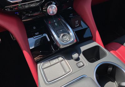
Swipes are still used for some actions like switching between screen pages on the system, but on a given page, you can use the pad to simply touch the spot corresponding to the desired location on the screen. The touchpad has a slightly concave design, which also helps you locate where your finger is on the pad without needing to look at it, and a prominent palm rest on the console keeps your hand in just the right position.
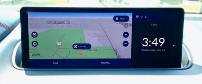
The main infotainment screen on the MDX is a widescreen design, with two-thirds or so of it dedicated to the main system functionality. The remaining portion on the right functions as a separate display that can be configured to show your current audio information, a small map with navigation info, or a clock. A small strip next to the touchpad lets you swipe vertically to easily change among these views.
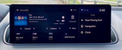
Additional buttons surrounding the touchpad include a home button, a back button, and a dedicated button for seeing and selecting among the available views for the secondary window rather than just swiping through them one by one. Another small rocker button near the trackpad makes it easy to skip forward or backward among audio tracks or radio presets, and there's a volume knob also in easy reach.
There's one significant downside to the True Touchpad Interface that I noted on the 2019 RDX, and it's still present in the 2022 MDX. It's not supported in CarPlay, with the touchpad instead requiring traditional swipes to move the cursor highlight around the CarPlay interface. This is almost certainly a limitation on Apple's part, and it's too bad it hasn't been addressed yet, as it's a bit of an inconvenience having to adjust your thinking about how the touchpad works as you swap back and forth between CarPlay and the native Acura system.
Wireless CarPlay
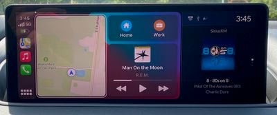
The 2022 MDX is the first Acura with wireless CarPlay, and as I've said a number of times before, it's really a game-changing feature. On short car trips when I know where I'm going and not worried about getting traffic information, for example, I usually don't find it worth digging my phone out of my pocket and plugging it in to get CarPlay up and running. Wireless CarPlay eliminates any bit of friction entirely, with CarPlay just automatically popping up each time you start up the car.
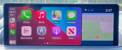
With the MDX's widescreen display, CarPlay takes up the majority of the screen, with the right side available to display your preferred information from the native system: audio data, built-in navigation, or a clock.
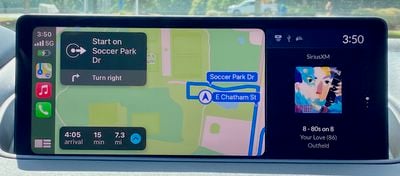
The generous 12.3-inch main display offers plenty of room for a large CarPlay view with the supplemental info from the native system displayed alongside, and its position high on the dashboard indeed keeps everything very glanceable and very close to your line of sight while driving.
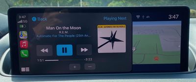
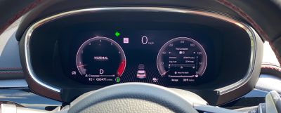
One welcome surprise I discovered with CarPlay in the MDX is that Apple Maps navigation is supported in the standard 12.3-inch digital instrument cluster. I've noted in a couple of recent reviews like the Volkswagen Tiguan and ID.4 that Apple rolled out support for this feature back in iOS 13, but car manufacturers are only just starting to support it.
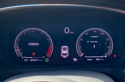
It's not a full-featured Apple Maps view, but basic text prompts for upcoming turns are included, which can be handy if you want to have the main infotainment screen displaying a different app. These Apple Maps navigation prompts are presumably also available in the head-up display, but that's an Advance Package feature that wasn't included on my tester.
Phone Charging and Ports
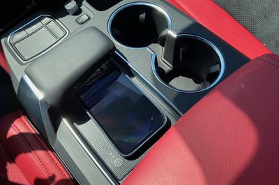
In addition to wireless CarPlay, which is standard on all trims, the MDX also includes a standard wireless phone charging pad. It sits right on the center console, partially tucked under the palm rest for the infotainment system touchpad, and it fits even my iPhone 12 Pro Max with Apple's leather case. Acura's specs say the wireless pad offers up to 15 watts of charging power, but presumably this is limited to Apple's standard 7.5-watt limit for iPhones as it's not a MagSafe solution.
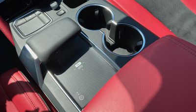
While the charging pad is convenient and a nice feature to have, I did find placement to be a bit finicky, and I frequently had to move my phone around on the pad a few times before it registered and began charging.
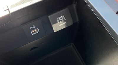
If you're looking for wired connections, the MDX offers quite a few options, with the main one being a USB-A charge and data port located inside the center console compartment so you can keep your phone or other device tucked away while connected to the system. One USB-C port and one USB-A port are located right on the console in a pop-up housing, but these are charge-only ports for some reason.
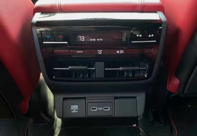
For second-row passengers, there is a pair of USB-A charge-only ports on the rear of the center console. The top-end Advance Package adds a 120V outlet in the second row and a pair of USB-A charge-only ports for the third row, but my test vehicle did not come equipped with those features.
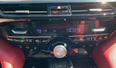
Primary climate controls remain thankfully separate from the infotainment system with a pair of easy-to-find rockers that can be moved up or down to adjust the temperature setpoints and a row of buttons to control other settings. Controls for the heated and ventilated front seats for both driver and passenger are located in a separate row below.
Wrap-up
The overall Acura infotainment hasn't changed a lot in the last couple of years, and I still find it to be a bit of a mixed bag. I'm definitely a fan of widescreen displays like this one that can show CarPlay and native information side-by-side, and the 12.3-inch infotainment screen offers plenty of real estate. It does mean that CarPlay is more of a standard aspect ratio than a widescreen one that could show more expansive map views, for example, but overall CarPlay looks good on the screen.
I'm very glad to see the addition of wireless CarPlay and a wireless phone charger, both of which thankfully come standard and don't require a higher-level or trim or package that includes thousands of dollars in extras you might not want or need.
Acura has had a few issues with its infotainment system in recent years, but the company has been pushing software updates to address them and hopefully things are pretty well ironed out at this point. I certainly didn't have any issues with it during my time with the MDX.
I'm still not sold on the touchpad interface for the infotainment system, although I do give Acura credit for trying something a bit different with the True Touchpad Interface. I appreciate that manufacturers like Acura and Mazda are seeking what they feel is the safest positioning for the infotainment screen by placing it high and set back on the dashboard, but in my opinion, the loss of direct touchscreen manipulation more than offsets the benefits of screen positioning when it comes to distractions.
Perhaps the biggest shortcoming with the touchpad interface for iPhone owners is simply the fact that the absolute positioning feature doesn't work in CarPlay, so your brain has to mentally switch gears depending on whether you're controlling CarPlay or the Acura system. I imagine it becomes a bit more natural over time, but it was a definite hurdle for me, even having previously tested the feature out on the 2019 RDX.
Still, if that's not a dealbreaker and you think it's something you can get used to, I think Acura's infotainment system is now pretty solid with good functionality and a clean look, as well as very good CarPlay integration.












Top Rated Comments
the navigation system is like a 90's era garmin with simple top down navigation and no advanced routing
terrible UI, clearly not design tested for vehicles. carplay has large, easy to see icons and text with minimal text.
i can't think of anything the tesla infotainment system can do that carplay can't do better.
Mazda, also slow to adopt carplay, similarly uses a dial rather than a touchscreen while driving, but can use a touchscreen while stationary.
It also means that carplay, built for a touchscreen, is a less satisfactory experience. Personally, I would not buy a car without full, proper carplay implementation.