One of the hottest electric vehicles at the moment is Ford's Mustang Mach-E, and I recently had a chance to spend some time in a 2021 model in First Edition trim to test out all of its features including the SYNC 4A infotainment system on a massive 15.5-inch portrait display with support for wireless CarPlay.
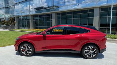
I went hands-on with the 2021 F-150 hybrid with SYNC 4 a few months ago, but the SYNC 4A infotainment system in the Mach-E offers a rather different experience.
The Mach-E offers very little in the way of hardware controls, certainly as far as the dash and center stack are concerned, with almost all of the vehicle's functions handled through the main infotainment screen that dominates the vehicle's interior. About the only hardware control in the traditional center stack area is a textured ring for controlling volume, and even that is mounted directly on the screen in a very neat touch.
SYNC 4A Infotainment
The SYNC 4A infotainment system is essentially divided vertically into four sections, with a narrow top bar at the top offering some high-level information on the vehicle and access to some shortcuts, a main app section, a card-based interface for changing between functions, and a climate control section at the bottom.
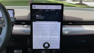
SYNC 4A relies heavily on the card-based user interface, with the swipeable row of cards offering information on and access to features such as the radio, onboard navigation, phone, owner's manual, and more. Tapping any of them brings the corresponding full app to the main portion of the screen. If you're using CarPlay, that will take over this primary portion of the screen that offers a generous amount of space, but you'll still have access to the native infotainment functions on the rest of the screen.
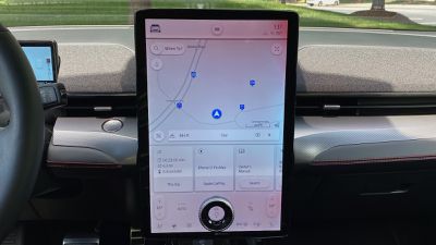
I've repeatedly noted that I'm not a fan of screen-based climate controls, so that's a knock against the Mach-E. Automatic systems are, however, getting more and more sophisticated to allow you to mostly "set it and forget it" with only the occasional temperature adjustment or a temporary shift to defrost mode, for example. You can also use the built-in voice assistant to make changes to your settings without having to touch the screen.
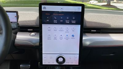
While the huge portrait display and the volume ring are very futuristic looking, I'm not a huge fan of the overall look of the SYNC 4A system, as it just feels bland to me. That blandness is even more noticeable when you've got CarPlay with its vibrant apps and icons displayed on a portion of the screen.
CarPlay
I still tell everyone who will listen that wireless CarPlay is a life-changing feature, even if you're coming from the wired version. Having CarPlay automatically pop up on the screen without having to take your phone out of your pocket just makes the whole experience so much smoother. So even for short drives where in the past I wouldn't have bothered digging out my phone and plugging it in, with wireless I've got CarPlay up and ready to go if I need it.
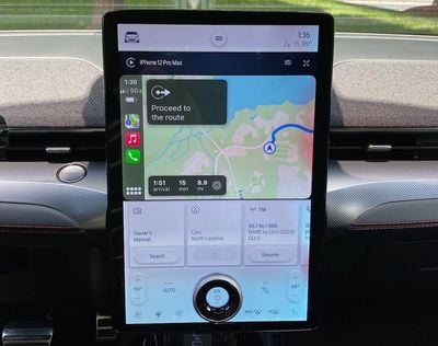
Fortunately, wireless CarPlay comes standard with SYNC 4A and the Mach-E, something that's becoming more and more common as car manufacturers have accelerated development on their infotainment systems in response to customer demand and rapidly changing technology.
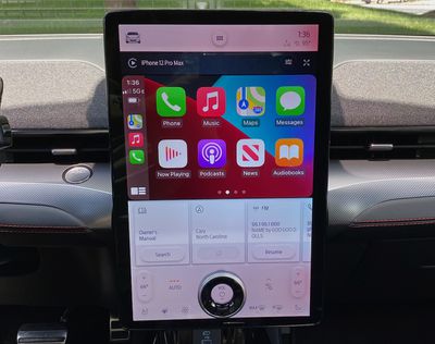
CarPlay is bright and vibrant on the Mach-E's display, and I like that it only takes up a portion of the screen so I still have access to information and controls from the native system. But while CarPlay is reasonably large on the screen, it's unfortunately not widescreen, which is a feature I've come to appreciate on many cars for the much more expansive view of navigation apps like Apple Maps. Still, CarPlay looks good and works well, and it's well-positioned to be visible while not being too far out of your line of sight while driving.
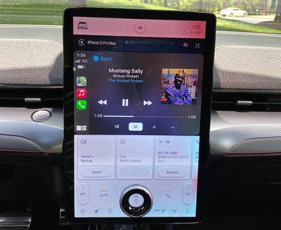
Ford has also recently rolled out a software update that enables CarPlay to take over even more of the screen, shrinking the native card interface in the row below and offering a more square aspect ratio for CarPlay, although this functionality wasn't available on my vehicle at the time of testing. It seems to have appeared first in the new GT models before making its way into other versions of the vehicle.
Digital Cluster
Similar to the VW ID.4, the Mach-E doesn't have much directly in front of the driver, going for a minimal look that relies on a 10.2-inch display to provide all of the relevant information.
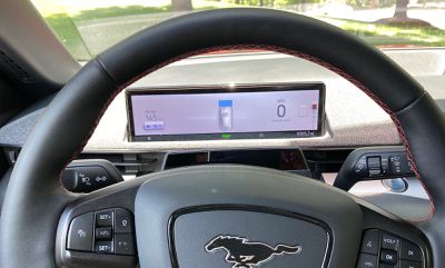
The display shows battery level and range data, current gear, speed, vehicle safety data, navigation prompts, and more, dynamically adjusting as needed based on what's happening with the vehicle. Second-screen navigation prompts for Apple Maps in CarPlay are supported on the driver's display, offering another way to help keep you headed in the right direction.
Charging and Ports
As with most of the rest of the hardware in the vehicle, connectivity options in the Mach-E are a bit sparse, but you do get a set of USB ports (one USB-A and one USB-C) located prominently below the center display for wired connectivity. There's another set of USB-A and USB-C ports for second-row passengers.

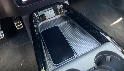
There's also a wireless charging pad adjacent to the front ports, located under a portion of a rubber mat for keeping other items from sliding around too much. The mat has dividers to separate the main bin into sections, and the wireless charging area is JUST big enough to accommodate a Max-sized iPhone. If you have a bulky case on yours, it might not quite fit.
Wrap-up
Given that this is an Apple site and not an EV site, I haven't focused on some of the main features of the Mach-E such as the driving experience, but I will say it was a joy to drive with the snappy performance you expect from an EV of this type. Acceleration off the line was excellent, thanks in significant part to my tester being a First Edition eAWD model with 346 horses and a 0–60 time of 4.8 seconds. It's not as quick as the new GT editions that can push that time down into the mid-3s, but it's a big step up from the lower-end RWD versions with times closer to six seconds.
As for the SYNC 4A infotainment system and CarPlay, I have mixed feelings about these. The large portrait display is certainly eye-catching, but I don't love the overall look and I wish more functions were still available as hardware controls. The portrait display pretty much precludes the possibility of a widescreen CarPlay layout, but aside from that, I thought it worked well with the SYNC 4A system.
The wireless connectivity was solid in my experience, and wireless phone charging worked well with the tight fit on the charging mat ensuring that my phone couldn't become misaligned while driving. And thankfully, both wireless CarPlay and wireless phone charging are standard across all trims.
I'm glad to see support for Apple Maps directions in the digital cluster coming to more and more vehicles, and Ford has done a good job making that information fit in with the overall look of the system.









Top Rated Comments
Now everyone is chasing this stuppid who get the larger displays in their car...probably in the future you will get a touchscreen steering wheel also