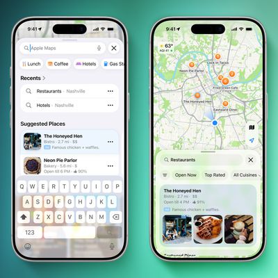
In iOS 18, Apple Maps has gained a new "Search here" button that makes it much easier to find what you're looking for in areas that aren't your current location or when you're exploring any new place on the map.

In earlier versions of iOS, if you search nearby for, say, gas stations or restaurants in Apple Maps, and then drag the map to another location with your finger, it will usually (but not always) auto-populate the new area with search results for the same request.
That behavior hasn't changed in iOS 18, but what you now get in addition is a "Search here" button that gives you more manual fine-grained control of the area in which to search. This is especially useful if you adjust the zoom level of the map, or scroll away only slightly from the original search – two instances where auto-populating results can be spotty or sometimes not appear at all.
Google Maps has had this feature for years, so it's good to see that Apple Maps has finally adopted it. iOS 18 also adds other improvements to Apple Maps, including topographic maps complete with trail networks and hikes (a feature that Apple first brought to the Apple Watch last year), as well as options to save favorite trails, download them for offline use, add notes, and get information like elevation and length.

iOS 18 is currently in public beta and will be officially released in the fall, around mid-September, when the iPhone 16 series is launched.


Top Rated Comments
And this is more of a Siri thing, but I also really wish I could ask Siri to navigate me to a specific place in a specific city—eg. “Siri, navigate to Home Depot in West Hills”. But she never understands this, so I always have to look at a list of results on the CarPlay screen, and I don’t know if it’s just me but these are almost not useful at all. It gives me results of all locations in like a 100 mile radius, and only shows the first part of the addresses—number and street and NOT the city—and who memorizes the street number of businesses? And the location markers on the map are not tap-able and don’t seem to visually correspond to locations on the list, so I’m not actually sure what the purpose of the markers are. Nor can I zoom in on the map. So it’s often near impossible to identify which location is the one I want. So that’s the other thing—in Maps, show the more relevant information in list results, like the city location instead of reviews, and have the map location markers be tap-able or at least correspond to list results and be zoomable.
Maybe it’s just me using it wrong, but I really wonder if the engineers are actually using their product in depth.