Apple in iOS 11 revamped the iPad's interface and changed the way we interact with the tablet through a new Dock, a revamped App Switcher, and Drag and Drop, and with iOS 12, further iPad changes have been implemented.
There are new gestures to learn for accessing the Home screen, App Switcher, and the Control Center, along with a new status bar.
The new iPad gestures are identical to the gestures on the iPhone XS, with Apple preparing us for the elimination of the Home button in future iPad models. Rumors suggest upcoming iPad Pro models will feature a TrueDepth camera system and Face ID rather than a traditional Touch ID Home button.
If you use an iPhone X, XS, or XR, the new iPad gestures will be familiar to you, but if you don't, it could take a bit of time to get used to.
Dock Changes: Getting to the Home Screen and App Switcher
In iOS 11, when you wanted to access the Home screen from within an app, you would press the Touch ID Home button. That's still true, but you can also now get to the Home screen when you swipe up from the bottom of the display, as demoed in the video above.
When in an app, swiping up from the bottom of the screen takes you right to the Home screen rather than just bringing up the iPad Dock within an app.
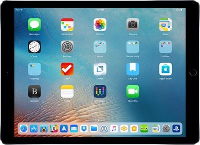
To get to the Dock to open more than one app for multitasking purposes, you need to do a swipe and a slight hold hold rather than just a swipe at the bottom inch of the screen while you have an app open already.
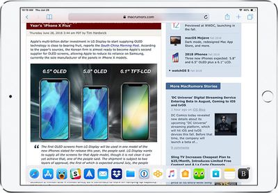
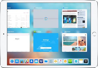
If you swipe and hold a bit higher on the screen, you can access the App Switcher on the iPad for quickly swapping between apps or closing apps, which is done with a swipe upwards on an app card. This gesture works both within apps and at the Home screen.
Getting to Control Center
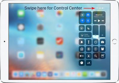
Control Center in iOS 11 was paired with the App Switcher and was accessible by swiping up on the Dock, but that gesture now opens the App Switcher alone without providing access to Control Center.
Getting to Control Center is now done by swiping downwards from the right portion of the status bar, where it displays your battery life and Wi-Fi/Cellular connection.
All other gestures on the iPad remain the same, such as a swipe downwards from the top middle of the display to bring up your notifications and a swipe to the right to get to the Today section for widget access, but there are other iPad improvements worth noting in iOS 12.
iPad Status Bar
The iPad's status bar has been redesigned in iOS 12, and it now resembles the status bar of the iPhone XS. The date and time are listed on the left hand side of the status bar, while battery life and Wi-Fi/Cellular signal and connection are displayed on the right hand side.
![]()
The middle of the display, where the date was previously shown, is left open, perhaps for a future notch. Prior to iOS 12, the iPad's status bar did not show the date, so that's also a new addition.
Spacebar Trackpad
When typing on the iPad, if you press and hold with one finger on the space bar, it turns the keyboard into a trackpad to make it easier to navigate through a document and move the cursor.

This is a feature that has been available on iPhones with 3D Touch and on the iPad with two fingers, but in iOS 12, it's simpler to use. A two finger touch also continues to work.












Top Rated Comments
"Intuitive" is something when you can grasp it without having to actually put in any thought about it. You get it simply by intuition, without the need for an explanation.
Tapping an icon on a screen with the finger is intuitive. Scrolling the screen content by pushing it in the direction you want it move is intuitive. Enlarging or shrinking something on screen by dragging its corners outwards or pinching them together is intuitive. Even using the home button to get back to the home screen is somewhat intuitive as you can understand it with a single exploratory press on the single large, conspicuous button on the front of the device.
Having to swipe down from one specific unmarked corner to pull down one overlay, while having to swipe down from the unmarked other corner to get another overlay, or making a weird swipe-partway-up-but-not-too-far gesture to get the app switcher is not intuitive.
These things might be easy to learn, but nothing of this is anything you would automatically do out of a purely intuition based expectation about how things work.
[doublepost=1530347008][/doublepost]So now it's annoying for anyone going back and forth between an iPad and any other iPhone. But hey, good for you.
Try to hand an iPad to somebody who has never used one and the person will be utterly lost. Things will feel pretty random to them. I have an original iPad with IOS 5 somewhere in the house. You could give this to a toddler and it would be able to make sense of it.
Edit: All of these gestures are actually pretty intuitive and simple, so if anything it's an improvement. But it is a bit of an adjustment to swipe to exit out of an app.