In iOS 17, Apple has added several new Messages features and tweaked the interface design of the Messages app to give it a cleaner look. This means that the way you navigate and perform certain actions in the messaging app has changed quite a bit.

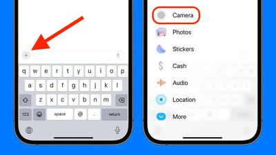
For example, previously in iOS 16, sharing photos involved tapping the Photos icon in the row of apps below the text input field to access your Camera Roll. But in iOS 17 both the camera and Photos buttons are gone, and all you have to tap is a + button to the left of the text field.
This + button brings up a vertical list of options, at the top of which are the Camera and Photos buttons. Compared to the row of app icons that consolidated all options in iOS 16, this makes for a much more simplified design, since it's easier to tell what's what with the larger icons and text descriptions.

However, it's hard to overlook the fact that accessing your photos now seems to involve two steps instead of one. Thankfully though, that need not be the case, because if you press and hold the + button next to the text input field, you will be dropped straight into your iPhone's Camera Roll, ready to select the pictures you want to send.

In iOS 17, Messages may have changed its look and feel, but the interface is actually now more customizable. You can, for instance, organize your iMessage apps and manage iMessage sticker packs right within the app. Click the links to learn how.


