Apple is expanding the iPhone's photo editing abilities in iOS 10 with a new feature called "Markup" that lets you doodle, magnify, and place text on any picture you have within the Photos app. Thanks to Markup's flexibility, it could be used for both casually sharing photos with friends and family, and also to enhance and add detail to an image in an enterprise situation.
Markup is also available directly through the Messages app in iOS 10, adding it to the roster of inventive and colorful updates coming to text messaging in the new iPhone operating system this fall. In both locations, Markup is a bit buried and somewhat difficult to find, so follow these steps to discover the new photo editing feature in iOS 10.
Finding Image Markup in Photos
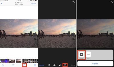
- Open the Photos app.
- Find the image you want to edit and tap on it.
- Tap the editing slider button.
- While in editing mode, tap the button that looks like an ellipsis within a circle and choose "Markup" from the popup menu.
Finding Image Markup in Messages
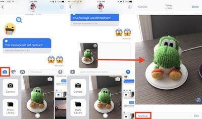
- Open Messages.
- Tap the contact you want to send the photo to.
- Tap the Camera icon to the left of the iMessage conversation box.
- Find the image you want to edit by taking a new picture, scrolling right to browse all your images, or scrolling left to jump into a vertical version of your Photo Library.
- Tap on the photo to place it in the conversation box, then tap on it once again within the box.
- Tap "Markup" in the bottom left corner.
Using Image Markup
In Photos or Messages, the editing features of Markup are mostly similar, although the former app presents a darker layout, while the latter has a lighter one. First, the feature lets you doodle on the picture you've decided to edit, with eight different colors and three different stylus thickness options to the right of the color dots.
Within each of the three options, you can change the thickness of the doodle by pressing harder or softer as you draw on the photo if you have a device that supports 3D Touch. If you begin free-styling on the photo and draw a recognizable shape, Markup will intelligently suggest a more true-to-form representation, be it a basic circle, oval, square, or even a star. You can also keep your hand-drawn option.
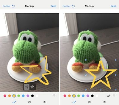
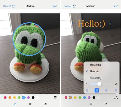
The second icon, to the right of the doodle feature, is a magnifying glass that can zoom in on any part of a picture it's placed over. After tapping on it, you can tap on the small green dot and then scrub it to the right to enhance the zoom of the magnifying glass. The blue dot will increase or decrease the circumference of the circle, while tapping anywhere within the circle will allow you to drag it around on the photo. After placing the zoom feature, tapping on any of the color dots will change the border of the magnification circle to match the color, while jumping into the thickness menu will let you alter the boldness of the border.
The last option on the bottom row of the Markup screen is a simple text box that lets you type out any message on top of the photo, and adjust its size by dragging the two blue dots on each side of the box. Similar to the magnifying glass, tap anywhere within the box to drag it, and double tap to add text. You can also change the color of the text by choosing any from the color dot menu, and a new "aA" option to the right of the color dots allows for new font options, sizes, and indentations.
Since there is no direct trash button, the only way to undo a mistake is a simple undo button, which is one of the major differences between marking up a photo in Photos or in Messages. In Photos, the reversed arrow is located at the bottom right of the screen; in Messages, it appears at the top left, next to "Cancel," once you start editing the photo. If you want to change a lot about the edits you've made to a photo, it's potentially faster to simply tap "Cancel" and then jump back into Markup to start over.
The biggest difference between Markup in these two apps lies in how permanent you want the edits to be. If done within Photos, your Markups will remain a permanent addition to each picture within the app, which can of course be reversed using the "Revert" option in the editing menu of each image. If executed within Messages, Markup is more transient, keeping the edits only on the version of the image sent to your contact, and not saving any edits onto the version in your own Photos app.





Top Rated Comments
Open a email with PDF attachment. Tap the toolbox bottom right. You're in markup mode.
Just had a play around and you can also save PDFs to iCloud Drive and it allows you to markup PDFs from there too (then send them however you want using the share sheet). This should be extra handy once macOS Sierra launches and iCloud Drive supports the Desktop and Documents folder from my mac, will make some my workflows slicker.