Although iOS 10 brings with it a few subtle visual and mechanical changes, some of its alterations to the most-used iPhone software features will probably be pretty easy to spot. One of those is the new Control Center, which has not only received a cosmetic upgrade, but has gotten a few new added abilities as well.
The Control Center, in essence, is no longer a single card stocked with all of the expected iOS features you've become used to seeing (like the flashlight, calculator, and timer) — it's now a sliding collection of three panels. The first is a basic launchpad of settings like Wi-Fi and Bluetooth, the second is dedicated to Apple Music, and the third houses your favorite accessories from Apple's new HomeKit-focused app "Home."
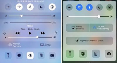
Some of these shuffled-around buttons can make Control Center in iOS 10 a bit discombobulating when you first bring it up, so follow this guide to get a general impression of how to use Control Center, and how to find your favorite features that may not be where they were before.
Navigating Control Center in iOS 10
From anywhere in iOS 10 (including the main lock screen), swipe up from the bottom of the iPhone to bring up Control Center. The landing tab of Control Center mirrors a lot of the features from iOS 9 and prior versions of iOS, because it's there you'll find Airplane Mode, Wi-Fi, Bluetooth, Do Not Disturb, and Portrait Orientation Lock buttons lined up along the top of the tab, all sitting above the brightness toggle.
The second row of buttons brings the first major Control Center change in iOS 10: two medium-sized squares for AirPlay Mirroring and AirDrop, whose locations have been flipped this time around. AirPlay Mirroring lets you mirror your iPhone screen on a connected Apple TV, while the AirDrop button lets you toggle between "Receiving Off," "Contacts Only," and "Everyone" for Apple's media sharing tool.
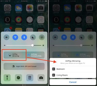
Night Shift has its own dedicated row, so you can enable or disable the feature before its scheduled on/off times — in iOS 9 it was a small icon between timer and calculator. Lastly, at the bottom of the first Control Center tray, you'll find the Flashlight, Timer, Calculator, and Camera, unchanged from iOS 9. New, however, are 3D Touch shortcuts for each app: the Flashlight can change intensity, Timer includes common interval options, Calculator lets you copy the last result, and Camera has multiple picture options.
Controlling Music
While in the first panel of Control Center, swipe left to switch over to the Apple Music panel. With the iOS 10 update, Apple has moved music playback and volume controls into its own separate panel. The change will undoubtedly be a hassle for many iOS users who listen to music regularly, but with a dedicated section of Control Center a few of the controls have been enlarged and a new feature has been added.
After starting a song in Apple Music, the new panel will come alive with the currently playing track, name of the artist and album, and scrub controls to jump to any section of the song. You can tap on any of these text readouts, and even the album artwork, to jump into the full Apple Music app. In addition to basic play, pause, rewind, and fast-forward buttons, and a volume toggle, Apple has introduced a new broadcast feature in Control Center as well.
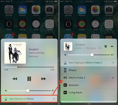
The button is located all the way at the bottom of the Apple Music section, and should default to "iPhone," so tap on it to see a list of potential devices you can connect to in order to expand the listening capabilities of the current track to a larger group. These devices could include any Bluetooth speaker within range that you've already set up via Settings, or a 3rd or 4th generation Apple TV. Choose whichever output you prefer to transfer playback to, and you can reset the iPhone as default by returning to Control Center, or simply powering down the connected device.
Controlling Home
If you plan on using Apple's new HomeKit app "Home," the third panel of Control Center should prove useful. Once synced up with any compatible HomeKit accessories in the main app, you can swipe left twice from the Control Center launchpad to gain a few basic controls over your smart light bulbs, thermostat, and more.
Before you get started in Control Center, make sure you have your accessories installed in Home. On the main screen in the app, tap "Edit" in the top right corner to rearrange your favorite accessories, the top nine of which will appear in Control Center. You can follow the same process to prioritize your favorite scenes to activate in Control Center.
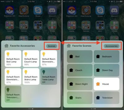
Within its section of Control Center, Home's actions are straightforward: you can tap each accessory to either turn it on or off, depending on its current state. More useful is a clever 3D Touch gesture that brings up a brightness toggle that allows for incremental percentage control of a connected lightbulb such as Hue, for example. Tap "Color" at the bottom of this screen to dive into a dynamic color wheel to pick six preset color options, or edit one to jump into a rainbow color selector to truly customize your lights within Control Center.
A "Temperature" wheel further lets you choose from brighter blue light or softer orange light. Although not automatic, this option is similar to Night Shift, letting you generate softer light at night to encourage better sleep. You can tap any empty space in these 3D Touch menus to return to Control Center.
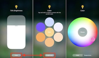
To get a glimpse of your favorite scenes — which are grouped collections of HomeKit accessories — tap the "Scenes" button in the top right of Control Center's third panel. Here you'll see your top eight favorite scenes, which offer similar on/off controls for each scene, but without any expanded 3D Touch support. Tap "Accessories" to return to the favorite accessories tab.
iOS 10 is full of new features that you'll find when you start playing around with the software update. Keep checking back with MacRumors for more helpful how-tos on everything from creating and sending handwritten text messages to avoiding tolls in Apple Maps to using lyrics in Apple Music and more.












Top Rated Comments
iOS 9 - swipe up, touch, touch, done.
iOS 10 - swipe up, touch swipe left/right, touch, done
The controls aren't logically grouped either - splitting Airplay sound and Airplay mirroring in particular is just plain dumb.
While I appreciate larger fonts and controls, the whole OS update is cartoonishly large - one of the ugliest iOS versions of all. They've reduced information density and increased the amount of navigation required to complete a task - it's a terribly inefficient UI.
And don't get me started on the music app.
Music App?
The swiping is a nuisance and I didn't get any new features for it, so I don't really see the point of having that extra page. The album art is not worth it.