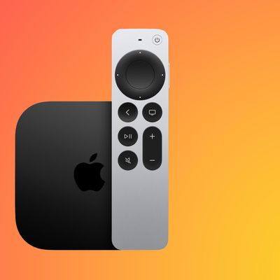
Apple's second-generation redesigned Siri Remote features a touch-sensitive clickpad that can be used to navigate menus as well as fast-forward and rewind video.
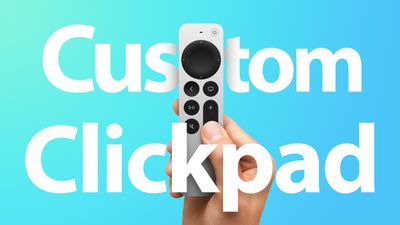
When you first start using the Siri Remote, touch surface tracking is on by default, but if you can't get on with the sensitivity or you're just not comfortable using touch controls on a remote, you can always customize it or turn it off.
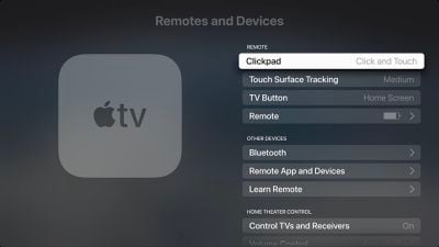
Change Siri Remote Clickpad Functionality
- Launch the Settings app on your Apple TV.
- Select Remotes and Devices.
- Select ClickPad.
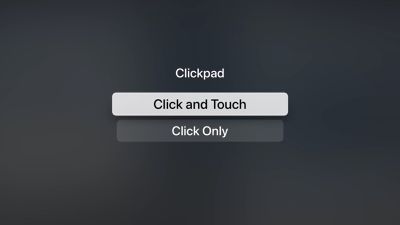
- Select Click and Touch to allow both clicking and touch surface tracking, or Click Only to turn off touch surface tracking.
Change Siri Remote Tracking Sensitivity
- Launch the Settings app on your Apple TV.
- Select Remotes and Devices.
- Select Touch Surface Tracking.
- Select Fast to make smaller thumb movements move farther on the Apple TV screen, or Slow to reduce tracking sensitivity.
![]()
If you're having trouble scrubbing through video when playback is paused, check our mini guide to make sure you're using the correct clickpad gesture.










Top Rated Comments
(YouTube seems to have swapped out their “smart tv” codebase for their “game console” codebase - it gains a few other features but loses the skip forward/back 10 seconds ability - clicking the left/right arrows will pause the video and move the cursor, and leave it sitting there with the video paused, not at all what someone used to the old function wants. The “skip forward/back 10 seconds while the video continues to run” feature seems to be heavily dependent on the underlying software.)
Still not used to the Mic button being on the side. But that's mice nuts and have pretty much adapted.
Overall it's a huge improvement.
I see it similar to how you do that most people pause instead of mute, and when watching stuff I’m really only going to use volume up/down and play/pause during viewing and prefer them stacked so they are near.
I feel the home/tv and back buttons are similar enough to be next to each other and then the mute button to me is fine where it is, mainly because I wont use it much and it’s next to the volume down button, resulting in basically what you are going for if you happen to hit the wrong button.
This is a lot of thought I’ve put into a remote with hardly any buttons lol and I’ll memorize them in the next day or so and never think about it again, but that’s how I would have preferred the remote setup.
That’s it though, everything else is perfect.
I mean, except for the obvious, no find my integration
I just got the new Apple TV yesterday and the scrubbing feature was exactly as easy as I expected any remote to be, but maybe that is not the case for everyone.