With iOS 16, Apple introduced a whole new look for the Lock Screen complete with widgets and customizability, and in iOS 17, the Lock Screen was further refined. Widgets are more useful than ever before, and there's a new StandBy mode that turns your iPhone into an information hub when it's not in use.
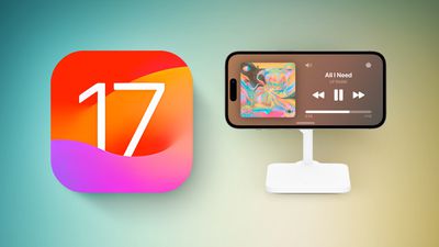
This guide highlights everything that's new with the Lock Screen in iOS 17.
StandBy
StandBy is a Lock Screen mode that activates when an iPhone is plugged into a charger and positioned in a horizontal (or landscape) orientation. It works with a MagSafe charger, which is arguably the most useful way to use it, but it also activates with a Qi-based wireless charger or a Lightning charger.
If you have an Apple Watch, it's similar to Nightstand mode, but it does more than Nightstand mode is capable of.
There are several different StandBy screens that you can choose from, some of which are customizable and some of which require unlocking the iPhone.
- Dual Widget Stacks - With this StandBy screen, you can swipe through widgets of your choice. You can set up two separate widget stacks with multiple Home Screen widgets, displaying two sets of information side by side. You can customize the widgets in each stack, and swipe through each side individually to change them.
- Photos - One of the StandBy screens shows content from your Photo Library, with the current time overlaid in the top right corner. You can see the date and location of the photo if you tap, and using this requires the iPhone to be unlocked so no one can see your images without your permission. You can swipe to change between themes like Favorites, Nature, Pets, Cities, and People. You can hide any themes that you don't like, and add additional albums.
- Time - The time StandBy screen displays the time and information like the current weather, the date, or when your next alarm is set for. You can select digital or analog time, and there are four digital themes including standard Digital, World, Solar, and Float. Float shows the time in big bubble numbers in customizable colors, Solar has more of a standard font with a solar flare design in different colors, and World shows the time with a map of the world and your current location highlighted. The Analog theme has customizable accent colors, and Digital has bold numbers with different color options.
With all of these StandBy screens, you can swipe left or right to swap between one of the three display options, and then you can swipe up and down to choose what's displayed. So if you've set up different Time screens, for example, you can swipe to change between digital and analog.
Notifications
Incoming notifications will be shown full screen when you have your iPhone in StandBy mode. So if you get an iMessage, for example, it will pop up with the name of the person and the Messages icon to let you know you have a message.
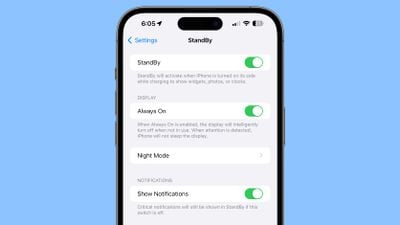
Content that would not normally be shown in a notification will not show up in StandBy mode unless you are nearby and have unlocked your device with Touch ID or Face ID.
Customizing StandBy
On any of the StandBy screens, you can long press to open options for customizing what you see. Long press on either of the widgets on the widget screen, for example, and you can choose the widgets that you want to see.
There are customization options for almost all of the StandBy display options, and it's worth swiping through and long pressing where applicable to change your setup to meet your needs.
- How to Customize Widgets in StandBy Mode
- How to Change iPhone Clock Style in StandBy Mode
- How to Customize the Photos Screen in StandBy Mode
- How to Disable the Red Tint in StandBy Mode
Always-On StandBy
With the iPhone 14 Pro and iPhone 14 Pro Max (and future iPhones), StandBy is more useful because of the always-on display. StandBy content is always on and active on these devices, without the need to interact with the iPhone.
On iPhones without always-on display technology, you need to tap the screen to activate it because it turns off after a short period. You can use StandBy with all iPhones, but it is a better experience with the always-on display.
Interactive Widgets
Lock Screen widgets were introduced with iOS 16, but in iOS 17, they're interactive, making them much more useful. On iOS 16, tapping a Lock Screen widget launches the accompanying app, but that step is not necessary for certain widgets that have tasks you can complete without an app.
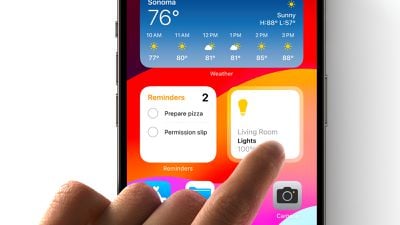
You can check off a task right in the Reminders widget, for example, or use the Home widget to control a smart home device without opening the Home app. Apple apps have interactive features, and third-party developers have an API to adopt interactivity too.
Interactive widgets are available on the Lock Screen and the Home Screen, so they can do more wherever you're using them.
Read More
More information about the new features in iOS 17 can be found in our iOS 17 roundup.


