iOS 27 Revamps App Icons With Sharper Liquid Glass Layers - MacRumors
Skip to Content

iOS 27 Revamps App Icons With Sharper Liquid Glass Layers

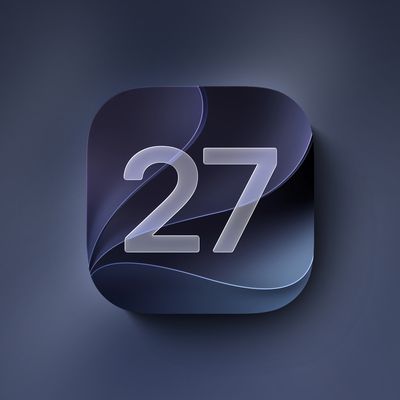
Apple has redesigned its first-party app icons for the second year running, with iOS 27 addressing blurriness complaints about iOS 26 by integrating additional layers of Liquid Glass directly into the icon artwork itself.
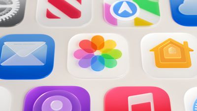
Photos App Icon Liquid Glass
When Apple introduced Liquid Glass with ‌iOS 26‌ last year, it redesigned its entire lineup of first-party app icons to give them a layered glass look with subtle depth. The approach drew criticism from some users who found the results blurry, and in some cases, a heavy specular sheen sat over the icon artwork, obscuring detail and giving icons a washed-out appearance.

The shimmering motion effect that animated icons dynamically as the device was tilted also caused a widely reported optical illusion, with asymmetric highlights in icon corners tricking the eye into reading icons as slanted. With ‌iOS 27‌, Apple is taking the icon design further rather than rolling it back.

The core change to how icons are constructed is the addition of multiple distinct Liquid Glass layers built into each icon's artwork, rather than the thick glass look applied uniformly over the top in ‌iOS 26‌. Apple says the new rendering pipeline adds more visual separation between layers, resulting in sharper edges and more defined refractions.

In practice, artwork is now considerably more visible and detailed with higher contrast and greater definition, with the glass look functioning as a refined finish rather than a dominant overlay. The refraction effects between layers are also selectively applied.

The motion-based shimmer has also been significantly reworked. The gyroscopic specular highlight effect introduced with ‌iOS 26‌ appears to have been removed entirely in the first ‌iOS 27‌ developer beta. Icons still feature highlights around their edges, now positioned at the top and bottom, but they no longer shift with device movement or produce the tilting illusion, and are much subtler overall.

Icon Composer, Apple's dedicated app icon design tool, has been updated to support building icons from multiple layers of Liquid Glass. New annotation features let developers add refraction effects or fine-tune content effects, while an interactive preview shows how a designed icon will render.

The updated icons are part of broader Liquid Glass refinements Apple announced at WWDC 2026, which also include a new system-wide transparency slider and improved material diffusion for better readability. For a full breakdown of all the Liquid Glass changes in ‌iOS 27‌, see our dedicated article.

Related Roundups: iOS 27, iPadOS 27, macOS Golden Gate

Popular Stories

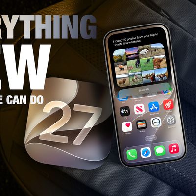
Everything New Your iPhone Can Do on iOS 27 Feature 1

20 New Things Your iPhone Can Do in iOS 27

Monday July 20, 2026 7:03 am PDT by
Apple will release iOS 27 in September, and despite the company's focus this year on refining its flagship operating system and nixing bugs, there are still many additional features on the way, not least of which is Apple's new context-aware Siri, re-tooled for the generative AI era. This year's major iPhone software update isn't all about AI, though, as the following feature list...
iCloud iPhone 17 Pro

iPhone Users Who Pay for iCloud Storage Get Two New Perks on iOS 27

Thursday July 2, 2026 6:10 am PDT by
If you pay for certain iCloud+ storage plans beyond the 5GB that Apple offers for free, you will receive two more perks on iOS 27 at no additional cost. A summary of the two new iCloud+ perks on iOS 27:Increased daily usage limits for some new Apple Intelligence features, including image generation in the revamped Image Playground app. HomeKit Secure Video cameras receive generated video...
iOS 27 Feature Dark

Apple Seeds iOS 27 and iPadOS 27 Second Betas to Developers

Monday June 22, 2026 10:08 am PDT by
Apple today seeded the second betas of iOS 27 and iPadOS 27 to developers for testing purposes, with the update coming two weeks after Apple released the first betas following the WWDC 2026 keynote. Registered developers can download the betas from the Settings app on the iPhone or iPad by going to the General section and selecting Software Update. iOS 27 introduces Apple's smarter...

Top Rated Comments

MinimeJer05 Avatar
5 weeks ago
Hopefully some additional tweaking will be done in upcoming betas. Some of the apps (Maps) nailed this fluid Liquid Glass look, while others (Messages, Email) look worse in my opinion.
Score: 14 Votes (Like | Disagree)
Orizaba Avatar
5 weeks ago
I do like the look of most of the new icons. The Safari icon, however, looks relatively unchanged since iOS 7. It looks a bit out of place compared to the rest of the aesthetic. Thoughts?
Score: 9 Votes (Like | Disagree)
5 weeks ago
the icons look a lot better, but DB1 has over-sharpened edges. I hope they reduce the black border they’ve added between each layer of “glass”
Score: 6 Votes (Like | Disagree)
M4irmidnight Avatar
5 weeks ago

I do like the look of most of the new icons. The Safari icon, however, looks relatively unchanged since iOS 7. It looks a bit out of place compared to the rest of the aesthetic. Thoughts?
I wish it broke free from the circle . Give me all blue like iOS 6.

Same with photos. Full flower lol
Score: 5 Votes (Like | Disagree)
Mike_Trivisonno Avatar
5 weeks ago
Can we make icons look different from each other? Every icon looks the same, a small rounded box with a small icon of something vague and rounded.

It's like they have Bigfoot designing icons. Well meaning but, well....
Score: 4 Votes (Like | Disagree)
Dust-by-Monday Avatar
5 weeks ago
The edge shimmer animations were basically pointless and not noticeable in iOS 26, especially considering you can’t turn it off to save battery.

I hope iOS 27 puts an end to it for good.

I also much prefer the highlights centered to the tops and bottoms of the icons to keep them from looking distorted or skewed with certain icon colors and backgrounds.
Score: 4 Votes (Like | Disagree)