Apple has released the fourth beta of the upcoming iOS 17 software release to developers for testing purposes, and like almost all new betas, the operating system brings a number of small tweaks and changes as Apple refines the software ahead of launch.

Here's everything new that we've found so far in the fourth beta of iOS 17.
NameDrop Toggle
In the AirDrop menu in Settings, Apple has added a "Start Sharing By" section that includes a toggle called "Bringing Devices Together," which allows users to manually switch NameDrop on and off.
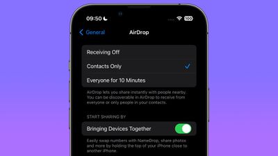
NameDrop is the new iOS 17 feature that lets you hold your iPhone near someone else's iPhone or Apple Watch to exchange contact information. Previously, there was no way to disable it.
iMessage App Menu
In iOS 17, all Messages apps and tools like the camera and photo options can be accessed by tapping on the "+" button, which brings up a menu column. In fourth beta, Apple has tweaked the design of the icons.
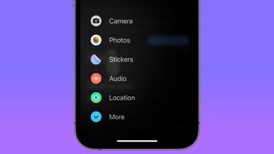
The Camera icon has changed from a shutter button to a traditional camera glyph. The Photos icon no longer shows the most recent picture taken, and is now just the standard Photos app icon. Cash, where it appears, now has a black circular background. The Audio icon has become a white waveform on a red background instead of a red waveform on a black background, and the Location icon is now encircled in green to look similar to Find My. The More icon is also circular instead of an oblong shape.
Standby Notification Preview Toggle
In the Standby menu in Settings, Apple has added a toggle called "Show Preview on Tap Only," which when enabled causes Standby to hide the preview of a notification until you tap on it.
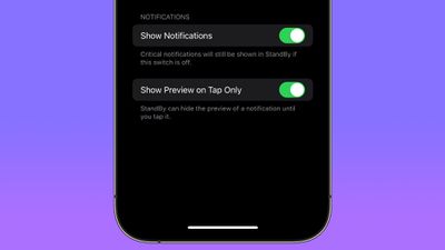
When you're not using your iPhone, you can put it horizontally on a charger to activate iOS 17's new StandBy mode, a full-screen display with information you can see at a glance.
Mental Wellbeing
Apple has made minor design refinements to the Mental Wellbeing section of the Health app, with updated animations when logging your mood.
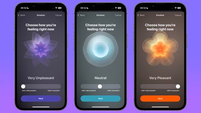
The animations have been made a little less angular, and are now softer, smoother, and slightly more florid.
New Home Screen & App Library Icon
Apple has changed the Settings menu icon for Home Screen & App Library, which was previously a white outline of an iPhone showing a Home Screen on a blue background.
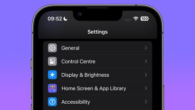
In the fourth beta, it is now represented by three rows of multicolored app-style icons on a purple background.
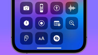
Tweaked Apple TV Remote Icon
In Control Center, Apple has made a minor tweak to the Apple TV Remote button, which now has a black circle representing the click wheel, while the Standby button in the top-right corner has been removed.
Other New Features and Changes
Find something that we didn't mention here? Let us know in the comments below.


