In the latest iOS 16 beta, Apple has updated the status bar battery icon on iPhones with Face ID to display the exact percentage remaining rather than just a visual representation of battery level, and while the change has been largely welcomed, some users are unhappy with the way it has been implemented.
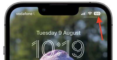
In iOS 15 and earlier, battery percent has not been present on iPhones that have Face ID because of the lack of space on either side of the notch that houses the TrueDepth camera hardware. The new design adds the specific battery level to the battery icon, providing a better idea of battery status at a glance.
In Apple's latest design, the white battery icon remains completely filled in as the battery level gradually depletes. When the semi-transparent percentage reaches 20% or lower, a fifth of the battery icon turns red and the rest of the icon becomes semi-transparent, while the percentage inverts to white.
Apple appears to have chosen this abrupt change in styling to ensure that the central percentage number remains legible as the battery level depletes – if a white bar depleted behind the number then it would be harder to make out at a glance, Apple's UI designers likely concluded.
Some users disagree with this approach, while others have suggested their own alternative designs for a battery status indicator with percentage level.
The new iOS battery percentage feature is a bit confusing. It’ll take time to get used to it. Seeing a filled battery icon with the numbers and half of the battery are two different understandings of how much battery is left. pic.twitter.com/eSA9ppiQv8 — Rokas (@samuolisr) August 9, 2022
Nothing wrong with what Apple released but I think I might’ve preferred something like Alternative A for the battery indicator pic.twitter.com/a44879RIFk — Mikael Johansson (@michaelnevernot) August 10, 2022
Just recreating the battery indicator pic.twitter.com/cK8PZDe9Y5 — Brian Michel (@brianmichel) August 9, 2022
For some, it's simply a case of calling out what they consider to be poorly thought-out UI design. For others, it plays into low-battery anxiety, a major trigger of nomophobia. Either way, it's become a surprisingly heated topic, while it's easy to forget that the percentage display is optional (caveat: It's enforced when in Low Power Mode.)
Of course, the battery level indicator design isn't set in stone, and Apple well could change it in a later beta of iOS 16 or the final release. Whether you're testing the latest public beta or not, what do you think about the way it's been implemented? Let us know in the comments.


