The Apple Watch Series 7 comes in new 41mm and 45mm size options and it has the largest display of any Apple Watch to date, a design challenge that Apple executives called "unique" in an interview with The Independent.
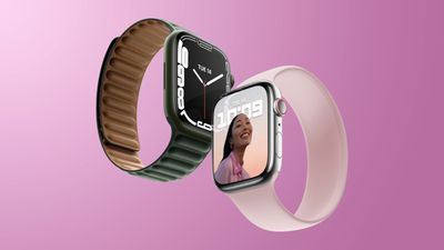
Implementing the new design without major increases to the casing size required "completely re-engineering the display, the front crystal, the internals and the internal enclosure," according to Apple's vice president of product marketing, Stan Ng.
Apple was able to reduce the borders on the Series 7 to 1.7mm, down from 3mm in the Series 6, and it's a noticeable change. The Apple Watch Series 7's launch was delayed until October after its September introduction, and rumors suggested that was due to the complicated design necessitated by the updated display.
The size increase was implemented only because Apple found a way to do it without compromising on other Apple Watch features. The touch sensor was integrated into the OLED panel, which kept the height of the Apple Watch the same and the general case size consistent.
"The re-engineered display on Series 7 is a major technical innovation. Growing the display is such a huge benefit to users, but only if it doesn't compromise any other part of the experience, such as comfort or aesthetics or battery life or band compatibility."
Apple's vice president of interface design, Alan Dye, said the company's goal with the update was to "make the user experience more clear and more accessible." The size increase required Apple to make hundreds of small UI changes.
"We knew this was an opportunity to optimize the design of the entire experience. So, we went about over the past couple of years reconsidering and recrafting every element, making hundreds of really small but we think important and impactful changes to make the UI to work in harmony with the new display design and making the UI even easier to use."
Text input on the Apple Watch has always been "a huge challenge," according to Dye, so the QWERTY keyboard that was implemented with the larger display was an achievement. Dye says that Apple always wanted a QWERTY keyboard. The bezels around the keys were removed to make it feel less cramped, a move that also conveys to customers that "precision isn't critical" because the keyboard uses machine learning to correct what you want to type.
Going forward, Apple plans to continue to innovate on the Apple Watch user experience, the information that's displayed, and cutting down on wasted space.
The full interview, which goes into more detail on design decisions like the new Apple Watch faces and Apple's obsession with typography, can be read over at The Independent.


