Chrome Ditched Redesign That Was Similar to Safari in iOS 15, Says Former Google Employee

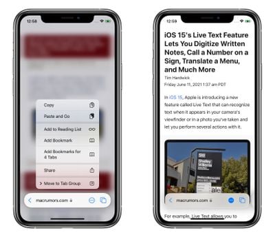
Apple introduced a sweeping overhaul to its Safari browser's interface on iOS 15, iPadOS 15, and macOS Monterey, with a redesign that includes an address bar that floats at the bottom of the screen, changes to the way users switch tabs, and more.
safari
Apple says this new-look Safari has been "reimagined for the way we browse today." In iOS 15, for example, Apple says the new floating address bar means Safari "maximizes your screen space and stays out of the way as you scroll and explore." However, some of the changes on both desktop and mobile have been heavily criticized by some users.

It turns out Google tried something similar in 2016 for its own home-grown browser. According to Chris Lee, a former Google designer, Google began developing a redesign for the Chrome mobile app called "Chrome Home" that was very similar to the one Apple is currently aiming at for Safari.

Lee was a staff interaction designer at Google at the time, and on his personal blog (via 9to5Google), Lee says he created the "original concept and pitch" for an "ambitious redesign of mobile Chrome's main UI."

It brought Chrome's toolbar to the bottom of the screen and turned [it] into a peeking panel that could be swiped to expose additional controls.

Swiping up on the address bar displayed the Discover and recent sites, Downloads, Bookmarks and History, while other features were accessible in a menu via an ellipsis (three dot) icon, which consolidated key browsing options and simplified one-handed operation in an era of growing screen sizes.

Lee says Chrome Home "caught traction internally, eventually becoming a Chrome org priority." However, after live beta tests and sustained experiments, the team received "a mixture of reactions."

The feature gained a cult following among the tech community, but for many mainstream users, the change felt disorienting. Chrome serves billions of users around the globe with varying tech literacy. Over the course of many iterations, I became increasingly convinced that launching Chrome Home would not serve all our users well.

So just as I strongly as I had pitched the original concept, I advocated for us to stop the launch - which took not a small amount of debate.

Ultimately, the redesign was killed off in 2018. Lee suggests that though Chrome Home was short-lived that doesn't mean it was a wasted effort, but rather a lesson about "the intentionality needed to innovate within a product of massive scale."

For Safari users, the question now is whether Apple's mixed feedback from its beta testers will be enough to steer the browser's redesign towards an end result that's more broadly acceptable to its user base, or if the company's intention lies in forcing through a change that it believes will grow on people given time.

Updates to iOS 15 Beta 3 and macOS Monterey Beta 3 suggest it could be the former: Apple has walked back some of the design changes it had in mind for Safari on both desktop and mobile, but we won't find out what the finished article will be like until both operating systems are released in September.

Tag: Safari
Related Forum: iOS 15

Popular Stories

iPhone SE 4 Thumb 1

iPhone SE 4 With Apple's Own 5G Modem 'Confirmed' to Launch in March

Tuesday November 19, 2024 12:12 pm PST by
Barclays analyst Tom O'Malley and his colleagues recently traveled to Asia to meet with various electronics manufacturers and suppliers. In a research note this week, outlining key takeaways from the trip, the analysts said they have "confirmed" that a fourth-generation iPhone SE with an Apple-designed 5G modem is slated to launch towards the end of the first quarter next year. In line with previo...
at t turbo indicator iphone 16 pro max v0 8hrh7w5f3w1e1

AT&T Turbo Indicator Showing Up in iPhone Status Bar for Subscribers

Wednesday November 20, 2024 3:42 am PST by
AT&T has begun displaying "Turbo" in the iPhone carrier label for customers subscribed to its premium network prioritization service, according to reports on Reddit. The new indicator seems to have started appearing after users updated to iOS 18.1.1, but that could be just coincidence. Image credit: Reddit user No_Highlight7476 The Turbo feature provides enhanced network performance through ...
Generic iOS 18 Feature Real Mock

Apple Releases iOS 18.1.1 and iPadOS 18.1.1 With Security Fixes

Tuesday November 19, 2024 10:10 am PST by
Apple today released iOS 18.1.1 and iPadOS 18.1.1, minor updates to the iOS 18 and iPadOS 18 operating systems that debuted earlier in September. iOS 18.1.1 and iPadOS 18.1.1 come three weeks after the launch of iOS 18.1. The new software can be downloaded on eligible iPhones and iPads over-the-air by going to Settings > General > Software Update. Apple has also released iOS 17.7.2 for...
anker new xmas 1

Anker Kicks Off Massive Black Friday Sale With Up to 50% Off Sitewide, Free Gifts With Purchase, Mystery Boxes, and More

Thursday November 21, 2024 7:53 am PST by
Anker today kicked off its big Black Friday sale, which is set to run through December 9. This sale includes notable discounts on portable chargers, USB-C hubs, cables, and more. Note: MacRumors is an affiliate partner with Anker. When you click a link and make a purchase, we may receive a small payment, which helps us keep the site running. There are a few bonus offers during this event as ...
apple card feature2

Apple Card 3% Daily Cash Back Now Available From Two More Apple Partners

Tuesday November 19, 2024 10:36 am PST by
Apple has partnered with select merchants to offer Apple Card users three percent Daily Cash back on their purchases, and two new companies were added to the partner list today. When purchasing goods and services from Booking.com and ChargePoint, Apple Card users will now get more cash back. Booking.com is a site for reserving flights, cars, cruises, and hotels, while ChargePoint sells...
Apple 2024 Black Friday Shopping Event feature

Apple Announces 2024 Black Friday Event, Offering Up to $200 Gift Card

Thursday November 21, 2024 5:10 am PST by
Apple's annual four-day Black Friday through Cyber Monday shopping event is returning on Friday, November 29 through Monday, December 2 in many countries, including the U.S., Canada, Australia, France, Germany, Italy, Spain, the U.K., and others. During the event, customers can get an Apple gift card with the purchase of an eligible product. In the U.S., for instance, Apple is including gift ...
airtag purple

AirTag 2 Rumored to Launch Next Year With These New Features

Sunday November 17, 2024 5:18 am PST by
Apple released the AirTag in April 2021, so it is now three over and a half years old. While the AirTag has not received any hardware updates since then, a new version of the item tracking accessory is rumored to be in development. Below, we recap rumors about a second-generation AirTag. Timing Apple is aiming to release a new AirTag in mid-2025, according to Bloomberg's Mark Gurman....
bug security vulnerability issue fix larry

Make Sure to Update: iOS 18.1.1 and macOS Sequoia 15.1.1 Fix Actively Exploited Vulnerabilities

Tuesday November 19, 2024 10:52 am PST by
The iOS 18.1.1, iPadOS 18.1.1, and macOS Sequoia 15.1.1 updates that Apple released today address JavaScriptCore and WebKit vulnerabilities that Apple says have been actively exploited on some devices. With the JavaScriptCore vulnerability, processing maliciously crafted web content could lead to arbitrary code execution. The WebKit vulnerability had the same issue with maliciously crafted...

Top Rated Comments

Apple Mac Daz Avatar
43 months ago
Hate the Safari on iOS 15 on my phone. that floating bar at the bottom is horrendous

Never mind swipe down to refresh. If on forums not good either if you wanna refresh to check for new posts
Score: 24 Votes (Like | Disagree)
contacos Avatar
43 months ago
Apple needs to rethink this abomination too. I am no longer using Safari on my iOS 15 testing device. It is annoying and not intuitive at all. How is anyone supposed to know you can press and hold on three different areas of the address bar to get different menus with additional options that are not part of the "..." so stupid.

I do not know how Apple is using the internet "today" but that is not it. Usually I scroll and read from the top downwards with most information being provided at the bottom because websites tend to have the navigation on top anyway. However, now that stupid address bar bubble is covering that very content I am trying to read!

Also the argument with the "maximised content" is such BS because now you got this big white space between the notch and the website content instead
Score: 18 Votes (Like | Disagree)
makitango Avatar
43 months ago
The problem is that the prior bar was condensed into the top combined bar w/ the notch (even smaller when scrolling down) and you received the full screen all the way down from there. Now you lose all that acreen estate that the iPhone X was advertising for.

Big design flaw.
Score: 14 Votes (Like | Disagree)
LawJolla Avatar
43 months ago
No one discusses the real issue... it's a complete mess for website that use bottom/footer navigation. Good luck clicking that chat icon for help.
Score: 11 Votes (Like | Disagree)
grr74 Avatar
43 months ago

Hate the Safari on iOS 15 on my phone. that floating bar at the bottom is horrendous

Never mind swipe down to refresh. If on forums not good either if you wanna refresh to check for new posts
I think the redesign is fantastic. The New York Times app made similar changes, moving controls to the bottom of the screen, which also improved the experience.

But perhaps Apple could give users the option of going with the new design or the old for those who don't want to change.
Score: 7 Votes (Like | Disagree)
creeman Avatar
43 months ago

No one discusses the real issue... it's a complete mess for website that use bottom/footer navigation. Good luck clicking that chat icon for help.
This is the most annoying part. Apple expects the Internet to redesign for them.
Score: 4 Votes (Like | Disagree)