Twitter Ends Threaded Conversations Tests After Negative User Feedback
This year, Twitter has been testing threaded replies for some iOS and web users, with the aim of making it easier to see how conversations evolve. However, it turns out the new-look, Reddit-style replies were actually more confusing for users of the typical conversation interface, and the company has decided to roll back the changes.

Those who trialed the new layout for replies saw lines and indentations that were supposed to make it clearer who is talking to whom and to fit more of the conversation in one view. Twitter also put engagement actions such as Like, Retweet, and Reply icons behind an extra tap in an effort to make replies to conversations easier to follow. The features were first trialed in the experimental twttr beta app and then added to the regular app a few months later.
But negative user feedback made the company revert the branching Twitter conversations to the classic arrangement, with many finding the style harder to read and join conversations. Twitter's Comms account said users would no longer see the threaded replies from Thursday.
Twitter hasn't given up on making it easier to follow conversations, and the company said it would continue to work on adding more context about who users are talking to, with a view to iterating its conversation settings to increase control. It seems the twttr beta app will no longer be ground zero for future experimental features on the social platform, though – Twitter said it is deactivating the app for the foreseeable future.
Popular Stories
Apple seeded the second iOS 26.2 Release Candidate to developers earlier this week, meaning the update will be released to the general public very soon.
Apple confirmed iOS 26.2 would be released in December, but it did not provide a specific date. We expect the update to be released by early next week.
iOS 26.2 includes a handful of new features and changes on the iPhone, such as a new...
Macworld's Filipe Espósito today revealed a handful of features that Apple is allegedly planning for iOS 26.4, iOS 27, and even iOS 28.
The report said the features are referenced within the code for a leaked internal build of iOS 26 that is not meant to be seen by the public. However, it appears that Espósito and/or his sources managed to gain access to it, providing us with a sneak peek...
Apple today released iOS 26.2, the second major update to the iOS 26 operating system that came out in September, iOS 26.2 comes a little over a month after iOS 26.1 launched. iOS 26.2 is compatible with the iPhone 11 series and later, as well as the second-generation iPhone SE.
The new software can be downloaded on eligible iPhones over-the-air by going to Settings >...
Apple today released new firmware designed for the AirPods Pro 3 and the prior-generation AirPods Pro 2. The AirPods Pro 3 firmware is 8B30, up from 8B25, while the AirPods Pro 2 firmware is 8B28, up from 8B21.
There's no word on what's include in the updated firmware, but the AirPods Pro 2 and AirPods Pro 3 are getting expanded support for Live Translation in the European Union in iOS...
Apple today released macOS Tahoe 26.2, the second major update to the macOS Tahoe operating system that came out in September. macOS Tahoe 26.2 comes five weeks after Apple released macOS Tahoe 26.1.
Mac users can download the macOS Tahoe update by using the Software Update section of System Settings.
macOS Tahoe 26.2 includes Edge Light, a feature that illuminates your face with soft...
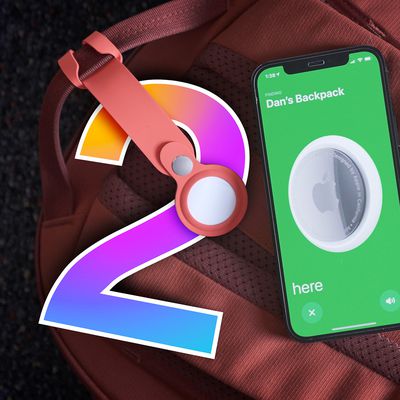
The AirTag 2 will include a handful of new features that will improve tracking capabilities, according to a new report from Macworld. The site says that it was able to access an internal build of iOS 26, which includes references to multiple unreleased products.
Here's what's supposedly coming:
An improved pairing process, though no details were provided. AirTag pairing is already...
Apple today released iPadOS 26.2, the second major update to the iPadOS 26 operating system released in September. iPadOS 26.2 comes a month after iPadOS 26.1.
The new software can be downloaded on eligible iPads over-the-air by going to Settings > General > Software Update.
iPadOS 26.2 continues with the multitasking improvements that were added with iPadOS 26.1. You can now drag and...
Foldable smartphone panel shipments are projected to jump 46% year-over-year in 2026, with Apple's entry into the market serving as the main catalyst, according to Counterpoint Research's latest Foldable-Rollable Display Shipment Tracker.
"Apple is the key driver as it starts to procure panels for its first foldable iPhone," said Counterpoint's Guillaume Chansin. The research firm expects...
