Microsoft has today announced plans to bring a new design to its Outlook for Mac app along with several other improvements and features for Outlook on iOS and watchOS.
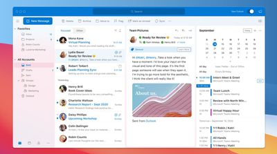
In preparation for the public release of macOS Big Sur, Microsoft has been testing a new design for Outlook on Mac. The design includes Microsoft's Fluent icons and several design cues from Big Sur such as rounded corners. To make the design more simple, Microsoft's Ribbon interface has been removed. The end product is an amalgam of the design languages of Apple and Microsoft.
Reading and writing emails has been improved with the implementation of a new mail compose UI, single-line views, and an "ignore" feature. Collapsible panels and a compressible message list allow for greater customization of the main view.
Outlook's contacts system has also been tweaked, with separation of contacts and co-workers within events and emails, detection of frequent contacts, and a new feature to mark contacts as favorites. Calendar and search has been improved with groups and emphasis on relevance, and there is greater integration with Microsoft Teams.
Microsoft's sync technology from iOS, Android, and Windows Mail will also be coming to Outlook for Mac, resulting in much faster sync between platforms. Support for iCloud and IMAP accounts is also said to be coming soon. The update is set to arrive for all Mac users in mid-October.
Microsoft also announced a number of smaller updates to Outlook for iOS, including a new calendar widget to display upcoming meetings from multiple accounts on the home screen, emoji reactions, voice commands, and an expansion of Play My Emails to Canada, Australia, India, and the UK.
Apple Watch complications will be coming to Outlook for watchOS 7, allowing users to see their number of unread emails or calendar status. These additions to Outlook for iOS and watchOS are marked to arrive later this year.


