A new Twitter client for iPhone and iPad launched today that aims to make it easier for users to manage their timeline and make the relentless stream of content on the social platform less overwhelming.
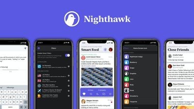
Nighthawk for iOS comes with several Smart Filter features that go beyond the ability to mute certain words and phrases, offering hundreds of human-curated filters for hiding tweets related to everything from politics to movie spoilers.
Your timeline should reflect what you care about, not the opaque agenda of a black-box algorithm. By default, Nighthawk displays tweets in the timeline chronologically, the way nature intended.
You're bound to come across some tweets that might rub you the wrong way, which is why Nighthawk provides tons of human-curated filters. Looking to take a break from election chatter? Add the U.S. Politics filter. Excited to see The Rise of Skywalker? Add the Star Wars filter and hide tweets with potential spoilers.
In addition to the topic filters, Nighthawk features a Close Friends timeline that surfaces tweets from users that you're likely to be most interested in seeing and hides everything else.
In that sense, the Close Friends feature is a bit like a Twitter list, but Nighthawk's developers say they've built the interface from the ground up with speed and accessibility in mind, so it should be a more enjoyable experience.
Nighthawk's developers say they're not trying to compete with or replace popular third-party apps like Tweetbot and Twitterrific. Rather, they see Nighthawk as a companion to these clients in offering users a more personal, streamlined Twitter experience when they want it.
Other Nighthawk features include rich link previews, haptic feedback, custom home screen icons, and dark and light modes that can switch dynamically with the system. The app costs $3.99 upfront, doesn't include ads and doesn't harvest user data. Nighthawk is available on the App Store today. [Direct Link]











Top Rated Comments
I'm the developer on this project, so I just thought I would quickly clarify that this is definitely more than one week old — my partner, who led design efforts, and I began development six months ago, and the app is the result of a lot of introspection, user research, and attempts to bring new ideas to the table for how a Twitter app can work. There's a lot more going on here than meets the eye at first.
For example, those filters aren't just lists of words that we've muted. They're each algorithms that use a lot of different factors, some we get from Twitter and some which we have to perform on-device analysis using tools like those offered in CoreML to ascertain, and we're hoping to bring out a system soon that lets you write your own sort of like you can make a smart folder in the Finder.
It's not perfect by any means, but we're laying a foundation now that we plan to continue building on, and matching the work of a massive multi-million-dollar iOS team at Twitter with two people is simply impossible. I'll be extremely lucky if I break even from the freelance work I turned down to focus my work outside my normal 9-5 job on this; we went in knowing it was probably a losing proposition, at least as we release our first version. So we're definitely not trying to be greedy.
We already have a lot of tweaks and fixes lined up for next year, many of which have beeen mentioned in this comments section as current issues. I look forward to bringing those out.
We're trying to experiment and bring new ideas to the table, and I know that's not for everyone. If it's not for you, that's OK. And if you already bought it and you're unhappy, we would strongly encourage you to use Apple's process to get a refund — the last thing we want is money from someone who thinks their purchase wasn't worth it.
This new app is curious.
If you follow the right people, Twitter is definitely the undefeated social media platform.