Twitter today announced the launch of a new Twitter.com experience on the desktop, which includes several new features and design changes.
The Twitter website on desktop has a whole new look that's cleaner and more modern, along with support for bookmarks so you can save tweets plus an easily accessible Explore page for getting a quick look at what's trending. Design wise, it's similar to the Twitter for mobile experience.
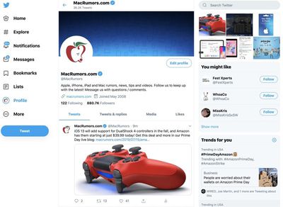
Account switching can be done using the side navigation bar, which is an easier way to manage multiple accounts. The new Dim and Dark Mode Lights Out themes have been added, and there are other new color options to personalize your profile.
So fresh, so clean. The updated https://t.co/JFPfsFhrLg is here. We heard you, and here’s some of what’s new: Built-in personalization, like colors and text size ☑️
More visible features, like Lists and Bookmarks ☑️ And so much more! Let us know what you think. https://t.co/Q5nkCw9Y2n — Twitter Design (@TwitterDesign) July 15, 2019
Conversations are easier to follow thanks to new conversation threading tools, and along with better access to bookmarks, the new web experience offers up quick access to lists and profile options.
On the Twitter.com website, some people will see an option to enable the new look now, and Twitter says it will be launching for everyone in the near future.
New features and a new look are launching soon. Bookmarks, account switching, dark mode, and so much more -- before long, you'll be able to see what's happening even faster.
Twitter has long been teasing its updated web experience, and Twitter for web users won't have to wait much longer to give it a try.










Top Rated Comments
[doublepost=1563218222][/doublepost]Problem is, it's always about making desktop sites more "mobile" and never vice versa.