Sling TV has updated its Apple TV app in an effort to simplify access to content and enhance discoverability on the online streaming television platform.
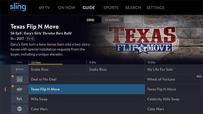
The new user interface upgrades, which are based on customer feedback, include improvements that put content front and center, while enabling subscribers to manage favorites and see more information about shows before viewing.
In the new larger grid guide view, more images and blurbs now appear for the currently selected show, while filters on the left-hand side of the screen filter channels by categories including My Channels, Sports, Movies, and Kids.
Meanwhile, individual channel guides can be accessed by clicking the channel logo on the left of the grid guide to see all the content available on that channel, and clicking a show now also offers more images and information on other seasons available via the streaming service.
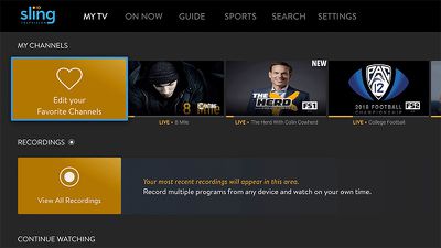
Elsewhere in the update, Favorite channels gain some visual UI improvements, and can now be managed by selecting an orange icon at the front of a row, allowing subscribers to view their recordings and edit content in the continue watching ribbon.
Lastly, tapping the Apple Remote touch pad during streaming now lets users view more information about what they're watching, including show name, description, closed caption options, player controls are more.
Sling says the new features for Apple TV are set to come to other Sling TV-supported devices in the future. See the Sling blog for more information.


