Following Tuesday's event, Apple Design Chief Jony Ive did an interview with The Independent, where he shared some thoughts on Apple's new product lineup and what makes a device "appear magical."
Ive explained that the design of the iPad Pro is "so singular and integrated" that it stands out from "99 percent of other complex technology products."
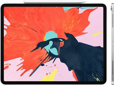
Specifically, Ive pointed out the display of the device, which uses a subpixel anti-aliasing technique to produce rounded corners that flow into the sides of the screen smoothly and without distortion.
Ive said he finds traditional displays with square corners "disappointing" because it turns the display into a distinct component when assembled into a design without square corners.
If you look at the iPad Pro, though, you can see how the radius, the curve in the corner of the display, is concentric with and sympathetic to the actual enclosure. You feel it's authentic, and you have the sense that it's not an assembly of a whole bag of different components: it's a single, clear product.
Ive said that one of Apple's goals with the iPad was to create a sense that the product is not oriented in a specific way. The new iPad Pro, says Ive, doesn't have an orientation because there's no Home button, speakers are all around the device, and Face ID works in landscape and portrait modes.
The simple flat edge of the iPad Pro is also an achievement, something Apple was able to implement when the engineering teams were able to pare down the thickness of the iPad Pro. Ive says Apple couldn't have attempted a straightforward edge detail like that when the products weren't as thin.
These seemingly simple changes are "the most difficult thing to do." Ive said Apple is most proud of the things that should be there but aren't. "It's an odd thing when you're most proud of those things which aren't there.
As for the second-generation Apple Pencil, the way that it snaps onto the side of the iPad Pro is an example of "a magical feeling." The new Apple Pencil connects to magnets built into the iPad Pro's enclosure, and when connected, it both pairs and charges.
Ive says that designing products like the Apple Pencil that introduce features no one knew they wanted until they debuted is a "fundamental part" of his job. He doesn't work with articulated problems and he says it's rare that new Apple designs come in response to a known problem.
Ive said when changing a well-known and loved product like the iPad, there's a need to not "fall into the trap of just making things different." It's important when changing things not to "make it different, but make it better."
"If you are making changes that are in the service of making something better, then you don't need to convince people to fall in love with it again. Our sense of habit and familiarity with something is so developed, there is always that initial reaction that is more of a comment on something being different rather than necessarily better or worse. In my experience, if we try very hard to make material improvements, people quickly recognise those and make the sort of connection they had before with the product."
Ive's full interview, which goes into more depth about the design decisions made for the iPad Pro, can be read over at The Independent.


