Twitter Adds Floating Compose Button and Tests Option to Switch Between Latest and Top Tweets - MacRumors
Skip to Content

Twitter Adds Floating Compose Button and Tests Option to Switch Between Latest and Top Tweets

by

Twitter has added a new compose button to its official mobile app for iOS that's designed for one-handed scrolling and tweet composing.

Located in the bottom right of the Twitter interface, the new floating icon can be tapped to start composing a tweet.

twitter new compose button
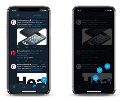
Meanwhile, a 3D Touch or long press gesture on the button causes three options to fan out in a radial menu that includes quick access to drafts, images/videos and the GIF gallery.

Elsewhere, Twitter has announced new tools for users to report spam. The standard Report Tweet options remain as usual, but flagging a suspicious or spam tweet offers the following additional options:

  • The account tweeting this is fake.
  • Includes a link to a potentially harmful, malicious, or phishing site.
  • The hashtags included seem unrelated.
  • Uses the reply function to spam.
  • It's something else.

In addition to the above, Twitter has started testing an option to quickly access a classic reverse chronological timeline, as promised back in September. The feature, currently only available to a small number of users, comes in the form new icon in the top right of the interface providing a shortcut to switch between the latest and "top" tweets in the feed.

twitter chronological
Once the feature officially rolls out, it should allay user frustration with Twitter's curated selection of tweets, which often includes a mishmash of relatively old tweets, ads, and tweets your friends like.

Tag: Twitter

Top Rated Comments

H3LL5P4WN Avatar
98 months ago
If I wanted to use a craptastic android app, I'd use a craptastic android phone. This material design button needs to go.

At the very least, the button needs to disappear when you scroll.
Score: 1 Votes (Like | Disagree)
Rogifan Avatar
98 months ago
So they add a floating compose button when it was perfectly fine where it was. If they want to move all the controls to the bottom for one handed ease of use with big phones fine but get rid of this floating buttons crap.
Score: 1 Votes (Like | Disagree)
98 months ago
What a horrible app.

Tweetbot was perfect except they removed most of the good features due to the Twitter API changing.

They won’t do anything about bullying or harassment, add an “edit” feature, but hey, let’s consider removing the “like button”
Score: 1 Votes (Like | Disagree)

Popular Stories

Four iPhone 18 Pro Colors Mock Feature

iPhone 18 Pro Launching in September With These 10 New Features

Monday April 20, 2026 7:13 am PDT by
While the iPhone 18 Pro and iPhone 18 Pro Max are not launching until September, there are already plenty of rumors about the devices. It was initially reported that the iPhone 18 Pro models would have fully under-screen Face ID, with only a front camera visible in the top-left corner of the screen. However, the latest rumors indicate that only one Face ID component will be moved under the...
Sad iPhone 18 Feature

Leaker: Apple to Downgrade iPhone 18 in Two Ways

Wednesday April 22, 2026 8:02 am PDT by
Following the emergence of a rumor that Apple is planning to downgrade the iPhone 18 to cut costs, further detail has emerged suggesting that display and chip specifications will see downgrades. Earlier this week, the leaker known as "Fixed Focus Digital" said that the iPhone 18 features "certain manufacturing downgrades" that bring it more into line with the low-cost iPhone 18e model. The...
Apple Maps General

Tim Cook Calls Apple Maps Launch His 'First Really Big Mistake' as CEO

Thursday April 23, 2026 5:29 am PDT by
Outgoing Apple CEO Tim Cook has named the botched 2012 launch of Apple Maps as his "first really big mistake" in the role, according to a Bloomberg report covering the town hall meeting that was held Tuesday with his recently announced successor, John Ternus. The Maps app launched with mislabeled landmarks, faulty directions, and a user experience that fell well short of Google Maps at the...