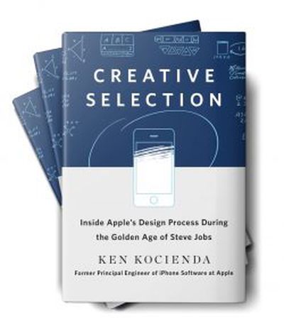
 Former Apple software engineer Ken Kocienda is releasing a new book entitled Creative Selection today, presenting a look inside Apple's design process through his involvement with a few key features across a variety of platforms and devices. I've had an opportunity to read through the book ahead of its debut, and it offers an interesting perspective on how Apple develops and refines features through an iterative process Kocienda terms "creative selection."
Kocienda, who joined Apple in 2001 and spent 15 years with the company, identifies seven "elements" he deems essential to Apple's success in software development, including inspiration, collaboration, craft, diligence, decisiveness, taste, and empathy. He delves a bit into how each of these elements contributes toward Apple's relentless pursuit of innovative ideas and solutions that end up being intuitive and useful to Apple's customers.
The process of creative selection is the overarching strategy for Apple's engineers, with small teams highly focused on rapid-fire demos of their work that allow the engineers to quickly iterate on their ideas and designs, saving the best elements of each iteration to rapidly reach levels of refinement required for Apple's final product releases.
Back in 2001, Kocienda was part of a team from former Apple engineer Andy Hertzfeld's software company Eazel that went defunct. Following Eazel's shutdown, Kocienda and Don Melton were hired on at Apple to develop Safari for Mac, and a number of other Eazel engineers ultimately joined them on the project. But in the first days of Apple's web browser project, it was Kocienda and Melton who got the ball rolling by trying to figure out how to port Mozilla to Mac OS X.
In Creative Selection, Kocienda spends several chapters walking through those difficult first steps, the inspiration of Richard Williamson to build Safari based on the lean and nimble Konqueror browser rather than Mozilla, and the Safari team's relentless effort toward building out a working web browser with an obsessive focus on speed.
As we introduced new features like clicking the back button to return you to your previously viewed web page, we found we couldn't perform the bookkeeping to manage the previous page at quick readiness without impeding the load of all pages. The PLT [Page Load Test] showed the slowdown. When we deemed such features too important to skip but couldn't figure out how to add them without causing such slowdowns, we instituted a trading scheme, where we found speedups in unrelated parts of our existing source code to "pay for" the performance cost of the new features.
[...]
None of this optimization was easy, and it wasn't always fun, but Don [Melton] always held the line. And in the year following the Black Slab Encounter [the first time the browser was able to load a real "web page" from Yahoo.com], we succeeded in making our code faster and faster.
Once Safari launched, Kocienda shifted to a project to bring WebKit-based rich email editing to Apple's Mail app, and he details the lengths he went to in order to make insertion point cursor placement behave properly, a feature that's more complicated than one might think.
Following a brief stint as a manager of Apple's Sync Services team for cloud data synchronization in which he found the job wasn't for him, Kocienda in mid-2005 boldly threatened to quit and perhaps move to Google if he couldn't be switched to a new role on the "new super-secret project" that was rumored within the company. He soon found himself interviewing with Scott Forstall, who invited him to join Project Purple, the effort to build the iPhone.
Kocienda's key contribution to Project Purple was the development of the autocorrect keyboard, and he walks through Apple's early efforts to figure out how a keyboard could work on the small screen of the iPhone. As the keyboard quickly became a roadblock for the iPhone's software design, the entire fifteen-person team was tasked with developing concepts. In demos for Forstall, Kocienda's early idea of large keys preserving the QWERTY layout but with multiple letters per key and a dictionary used to predict which word the user was trying to type won out and he was placed in charge of keyboard development.
That was of course just the start of the keyboard project for Kocienda, and he walks through the evolution of the design, the trials and tribulations of building a comprehensive dictionary to drive the autocorrect functionality, and the decision to ultimately go back to single-letter keys with algorithms for key prediction and autocorrect.
Through all of this, Kocienda had never seen the design of the actual iPhone, as hardware design was completely separate from software and his team had been using "Wallaby" prototype devices tethered to Macs as their software development and testing platforms. It wasn't until late 2006 that Kocienda got his first look at the actual iPhone Steve Jobs would show off just a few weeks later at Macworld Expo.
When Kim [Vorrath] passed the prototype to me, she asked me to handle it gingerly. I took it from her. The glass display was striking—far brighter and sharper than the Wallaby screen we'd been staring at for more than a year. I turned the device over in my hand. It felt solid, like it was filled to the brim with the latest technology, and it was. In fact, at that moment, it was overflowing a bit.
I paced back and forth a few times to feel the freedom of movement that came with untethering from a Mac. The Wallaby experience had been about feeling tied down to a computer on a desk with cabling spidering out everywhere. Now, for the first time, as I put the phone in my pocket, I got an idea of what it would be like to use a Purple phone.
Naturally, I was most interested in the keyboard. I typed out a few words in the Notes app. The keyboard worked without a hitch. My autocorrection code stepped in to fix all the mistakes I made. I could have spent all day with the device, trying out everything I could think of, but other people were waiting for their turn. As I handed the device over, I had no question in mind.
I wanted one.
Kocienda never had the opportunity to demo any of his iPhone work directly to Steve Jobs, but he did get that chance several times during his subsequent work on the iPad's software keyboard. Kocienda shares the experience of that demo in the very first chapter of his book, describing how he was initially planning to offer users the ability to choose between a Mac-like keyboard layout with smaller keys and a scaled-up iPhone-like keyboard with larger keys more similar in size to physical keys.
He turned to look straight at me.
"We only need one of these, right?"
Not what I was expecting. I think I may have swallowed hard. Steve was still looking at me, and so, with a half shrug, I said, "Yeah . . . uh . . . I guess so."
Steve sized me up a little and then asked, "Which one do you think we should use?"
A simple question, clearly directed at me and only me. Steve didn't shift in his chair or motion toward anyone else in the room. It was my demo, and he wanted me to answer.
And then something happened. Standing there, with Steve Jobs staring at me, waiting for me to respond to his question, I realized that I knew what to say, that I had an opinion.
"Well, I've been using these demos for the past few days, and I've started to like the keyboard layout with the bigger keys. I think I could learn to touch type on it, and I think other people could too. Autocorrection has been a big help."
Steve continued looking at me as he thought about my answer. He never moved his eyes to anyone or anything else. He was completely present. There he was, seriously considering my idea about the next big Apple product. It was thrilling. He thought for a few seconds about what I had just said and what he had seen on the iPad. Then he announced the demo verdict.
"OK. We'll go with the bigger keys."
Overall, Creative Selection is a worthy read, focusing on a few detailed anecdotes that provide a terrific inside look at Apple's design process. Given Apple's size and the way the company compartmentalizes its projects, Kocienda doesn't necessarily have a high-level view of things, but he does a good job drawing on his experiences to discuss his individual philosophy and that of the teams he worked with, extrapolating that to the unspoken criteria used across the company to drive the creative selection process that has yielded the products and features we've all come to know.
Creative Selection is available now from Amazon, the iBooks Store, and other retailers.


