Popular iOS and Android weather app Dark Sky has updated with "one of the biggest overhauls" to date, according to a new blog post that the company shared online today.
The update introduces a new visual look and the home screen now has a "unified timeline," which combines various aspects of your local forecast onto one page instead of separating them into multiple areas. Now, you can view the current conditions, next hour rain, next 24 hours, and next week forecasts in one scrollable tab.
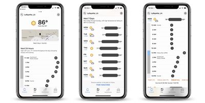
At the top of the Forecast tab Dark Sky now has a precipitation map below the current temperature and next-hour graph. This should "provide more context" to forecasts when quickly launching the app, according to the developers.
For the next 24 hours forecast, you can tap between the temperature, "feels-like" temperature, precipitation, wind, wind gust, humidity, dew point, UV index, and cloud cover by scrolling through the red text under the graph. This updates the graph with the relevant information, and is also available to look at for days in the upcoming week.
At the bottom of this tab is a "Time Machine" feature that shows the weather going back decades, and can also provide seasonal average weather for days beyond the next week. Grossman points out that this can be useful for planning trips and vacations.
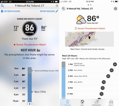
The next major addition is a saved locations feature, which is a standard addition to many weather apps that Dark Sky has lacked over the years. Now, you can save multiple locations in the app to check the weather in different cities by swiping the forecast left or right.
Notifications have been improved, with custom notifications that let you create your own weather alerts for the conditions you care about. Instead of alerts solely tied to precipitation, now you can create push notifications that warn you about high UV indexes and more. To do this, you will have to set location access to "always" for Dark Sky in the iOS settings app and allow notifications.
There are also new updates to the app's iconography and completely rewritten internals:
We’re incredibly grateful to The Iconfactory for redesigning our set of weather icons. Gone are the stark black-and-white glyphs, having been replaced with more easily recognizable — and colorful — icons and buttons.
This update isn't just a visual refresh: On iOS, we’ve completely rewritten the internals of the app from scratch. It is, effectively, an entirely new app. This means it should be far more stable and responsive, it loads faster, and it sets us up to much more easily incorporate new features and enhancements in the future.
Dark Sky has been a popular third-party alternative to Apple's own Weather iOS app for a few years now, particularly for its ability to warn you about impending bad weather. Apple has highlighted the Dark Sky app and its useful features in the past, particularly in a short Apple Watch commercial titled "Rain" from 2016.
Grossman says that with the launch of the new update, users can expect to see "more frequent" updates as well from now on, with new features already in the works. Dark Sky users on iOS and Android can get the new update for free starting today, and those who haven't downloaded the app yet can do so for $3.99.












Top Rated Comments
I liked the semi translucent background before rather than the stark white we have now.
I'd love to see a dark mode on this so the white isn't just screaming at me.
While the update is nice overall, it is still plagued by requiring too many scrolls or unnecessary clicks for many operations.
You want to see weather details? Click on today's forecast and it pops a modal dialog box. Swiping does not dismiss modal dialog box. You need to click a small Done button on the bottom or surrounding background to dismiss.
Looking at forecast requires a lengthy scroll.
Changing to precipitation, wind, or feels like temperature requires scrolling to the bottom of hourly forecast and click on the tiny touch target.
And so on.
Finally, I find Dark Sky's weather data to be highly suspect. When the app first came out, it was very accurate, easily my favorite. But it is frequently off by many degrees, sometimes 10 degrees. And the famous precipitation notification almost never works.
Swipe exactly on the buttons and get more button choices.
Miss it even slightly and you swipe to another view.
Other than that, I'm pretty happy with this update.
i use http://www.forecastadvisor.com/ to determine which weather source is best for my area - and that's WU.
which is why i like carrot -- snark and personality aside, i can use WU for daily and hourly forecast and dark sky for immediate oncoming weather.
https://www.microstru.com/DS-1
Went from one of the best examples of clean, sophisticated design to crap overnight. Honestly, is this a joke?
No.