Netflix today revealed a new design for its "TV experiences," or TV-based apps, that aims to make it easier to find TV shows and movies on the service.
In addition to the rows with various themes, Netflix subscribers watching on a TV will now see a sidebar on the left side of the app that expands when they scroll over to it. This UI has Search, Home, Series, Movies, My List, and New hubs, making it far simpler to jump directly to specific sections of Netflix you want to get to without having to scroll around looking for them.
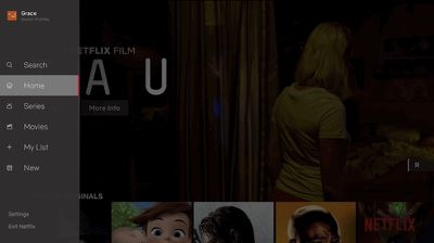
Otherwise, browsing around Netflix on a TV app appears to be largely the same, with video previews that automatically play once you've stopped on a show or movie. Netflix's director of product innovation Stephen Garcia said that the new update came out of "extensive research" into how its users browse for content.
While this may feel like an obvious update to some, validating that this TV experience was better for our members took extensive research, testing and technology improvements. Along those lines, we will continuously learn from our members and evolve the TV experience so that it gets even more simple, fun and easy to find the stories that make Netflix great.
In our testing of this new interface, we saw that that this simpler design helped members find something great to watch.
The company didn't directly confirm which platforms this update will arrive on, but it typically uses "TV experiences" as an all-encompassing reference to apps on streaming boxes, game consoles, smart TVs, and anywhere else Netflix is viewed on a TV set. This should mean that fourth-generation and fifth-generation Apple TV users will see the update alongside other platforms, with a rollout that begins worldwide today.




















Top Rated Comments
[doublepost=1531939134][/doublepost]and THIS!