Apple didn't touch upon Apple Music at all during its WWDC keynote yesterday, leaving any potential new details about the streaming music service to be discovered by early beta testers of iOS 12. For now, it appears that Apple Music remains largely the same between iOS 11 and iOS 12, but some Redditors have discovered at least one update for artists and their profile pages in the Music app on iPhone.
With the update, artist profiles now have larger images that take up half of the screen on iPhone. Under the image is the artist's name, accompanied by a new play button. According to users on Reddit, this button shuffles all the songs in the artist's catalog of music, making it easy to search for a band or singer and simply tap the button to start playing their music. Otherwise, the rest of the page appears normal with Top Songs, Albums, Top Videos, and more that can be discovered as you scroll down.
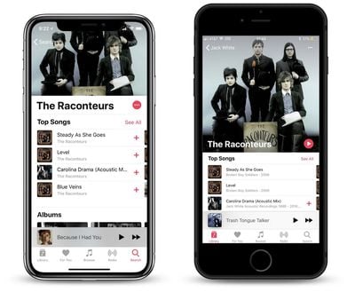
In comparison, Apple Music artist pages on iOS 11 have much smaller artist images. As visible in the comparison image above, for some bands like The Raconteurs it's easy to see why Apple would want to switch to larger artwork when some artists have most of their images cut off by the current layout.
At the same time, the iPhone X and the notch still negatively affect some artist images even with the new iOS 12 layout (like Rihanna below), so it appears Apple has some more tweaking to do to get this section of Apple Music right.
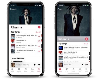
Instead of a play button, Apple Music in iOS 11 currently has an ellipses menu next to the artist's name with options to Follow on Connect, Create Station, and Share Artist. Creating a radio station is somewhat similar to playing more of the artists music with the new play button, but it crucially diverges from that feature since radio stations also throw in songs from different artists, focusing on the genre/style of the chosen band and not the band itself.
Other images of the new profile pages have surfaced on Reddit, including for Green Day, and it appears that there is currently a slight gradient bug where the artist's name sits.
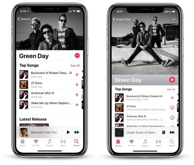
As Redditor tynamite explained, in the iOS 12 beta right now if you travel to an artist profile from your own library, a gray box will appear behind the artist's name. But, "If you search or find an artist through other ways of exploring (eg. "similar artists" option), it doesn't show the gray background at all." As such, this is likely a simple UI bug that will be fixed in future beta updates.
There are plenty of other tidbits to discover about iOS 12, including a lyric search feature to discover songs in Apple Music.












Top Rated Comments