Graphic designer Álvaro Pabesio shared his vision for an updated, enhanced Apple Music on Behance earlier today, and it's an impressively detailed look at UI tweaks and changes that Apple could make to fix a few user gripes with its streaming music app. As you look at Pabesio's designs, remember that this is a concept and in no way indicates or confirms what we'll see with Apple Music in iOS 12 later this year.
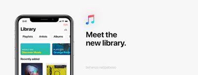
To start off, Pabesio revamped the Library tab, removing the vertical list for Playlists, Artists, Albums, and Songs, and introducing a horizontal tab bar that you can scroll through. With more space afforded from this change, new daily suggestions pop up right in Library for playlists, stations, artists, and personal mixes the app thinks you'll like.
Pabesio nixed "For You" completely by introducing features from this tab into other parts of the app, so the second tab is now Browse. Here you can perform the usual artist and album searches, and find the latest songs and new releases, but Pabesio added in a few details to truly expand browsing on Apple Music.
More information is now displayed on the screen at once, thanks to the reduction of the current app's large image banner carousel and the same horizontal scrolling bar from Pabesio's Library tab. Pabesio highlights a much smaller new album/song carousel at the top of his concept, "Trending now" tracks, and places your personal mixes on this page as well.
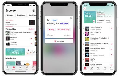
In the graphic designer's imagining of Apple Music, you can provide even more granular feedback into mood playlists by filling out a prompt, like "I'm [happy] and feeling like [going out]." Pabesio's description says depending on your response Apple Music will take into account the music in your Library, the mood you chose, and find "up to 5 hours of selected music" for you to listen to.
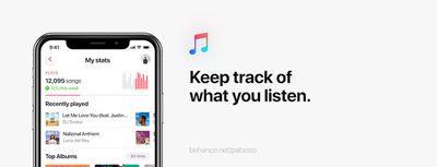
One of Pabesio's biggest overhauls is a new "Social" tab, taking the rudimentary features Apple added in iOS 11 last September and greatly expanding upon them. When you open the tab you see a similar horizontal tab bar like the one found in Library, and it houses Stats, Friends, Rankings, and more. Apple Music can now show your plays broken down weekly, monthly, yearly, and all time, and even lets you know if you did above or below average in terms of music listening each week.
Each user's page now shows their song play counts, following and follower counts, and when you visit someone it'll provide a taste comparison graph, similar to music social network Last.fm. Underneath that, Apple Music profiles now show individually played songs, instead of just displaying the latest albums or playlists the user listened to.
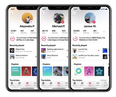
These can still be seen too, however, with even more displayed on profiles like playlists, top artists, custom playlists, and more. For Apple's curated playlists, these also show follower counts, as well as up and down arrows to show when songs change position on charted playlists. All of these ideas extend to official artist pages as well.
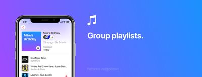
Expanding even further on the social features is a new group playlist ability, so you can create public or private playlists with up to 50 friends. Pabesio also notes tiny fixes like "relevant notifications," a "revamped album view," and the return of double-tapping artwork to love a song.
Overall, Pabesio's Apple Music concept is an interesting look into ideas that Apple could incorporate into the Music app down the line, and there's much more to check out on his Behance page, including his tweaks to Apple Music on Mac. We should be hearing about any updates coming to Apple Music very soon, with the reveal of iOS 12 and much more at WWDC just two weeks away.


