Snapchat has adjusted its iOS app interface to placate a large number of dedicated users who complained about the recent redesign, reports The Verge.
Snap unveiled its radical redesign in November with the goal of creating a personalized user experience that's easier to navigate, especially for newcomers. But the change didn't go down well with many long-time users, so much so that 1.2 million of them signed a petition asking the company to walk back the UI changes.
Snap initially responded to the outcry in February by acknowledging that "the new Snapchat has felt uncomfortable for many", but went no further than to reassure users that they would eventually adapt to the changes over time.
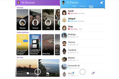
However, it appears the company has now decided to roll back at least some of the adjustments it originally made as part of last year's redesign. For example, Snaps and Chats have gone back to appearing in chronological order, while Stories from friends have reverted to their original location at the right-hand side of the interface.
Similarly, Snapchat now opens in camera mode, as it did prior to the redesign, and users can again swipe left to view the latest friend posts. Elsewhere, a separate subscriptions feed lets users search separately for stories by publishers and popular content creators. The changes come in an update to the iOS app that the company says is currently rolling out to users.
Snap originally made the changes to appeal to a broader demographic and expand its user base, in the hope of fending off the threat of encroaching rivals like Facebook and Facebook-owned Instagram.
However, the company's first quarter earnings suggest the strategy has so far failed to boost earnings, with Snap making less money per user despite having grown its global user base by around four million over the previous quarter.











Top Rated Comments