At its Google I/O event taking place in Mountain View, California this morning, Google showed off features that are coming in Android P, a new version of Android that's set to launch this fall.
Google is focusing on three parameters for Android P: Simplicity, Intelligence, and Digital Wellbeing. Android P has a new gesture-focused interface, which is similar to the interface that Apple introduced for the iPhone X. "The new design makes Android multitasking more approachable and easier to understand," said Android Engineering VP Dave Burke on stage, after explaining that Google has been working on it for more than a year.
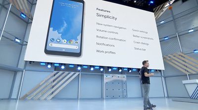
Android P does away with the standard three button home, back, and multitasking lineup that's been available on Android devices for the last several years.
Instead, As with the iPhone X, there's a little oblong navigation button at the bottom of the screen that enables several gestures like swiping up to access a card-like interface that displays a search bar and recently used apps. A single upwards swipe goes straight into the app overview, which includes a list of recently used apps as well as a search bar and five predicted apps at the bottom of the display. You can swipe through the apps to go forwards and back through them.
A second swipe up on the button icon opens up an All Apps screen where all of the apps installed on the device are located for quick access. "Architecturally, what we've done is combine the all apps and overview spaces into one," said Burke.
As might be familiar to iPhone X users, the swipe up gesture works from anywhere in the Android phone, no matter which app is being used, while a tap brings you to the Home screen. Swiping left or right in a "Quick Scrub" gesture lets you swap between your recently used apps, something taken directly from iOS.
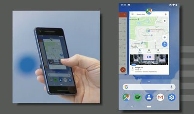
All of these gestures look and feel a lot like the swipe-based gestures that are used on the iPhone X to do things like access the Home screen and switch between apps.
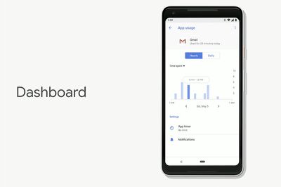
Google is focusing on digital health tools in Android P, which is something Apple is also expected to feature in iOS 12. There's a new Android Dashboard that's designed to let you know how much time you're spending on your phone and within individual apps to maximize for meaningful engagement.
The feature will let you set time limits on apps, and after a set amount of time is spent in a given app, the app's icon will be grayed out for the rest of the day to discourage you from continuing to use it.
Google is also introducing Do Not Disturb features to silence calls, notifications, text messages, and other alerts. Do Not Disturb can be enabled automatically through a new "Shush" feature that will activate whenever an Android smartphone is turned face down. This automatic activation silences all incoming alerts with the exception of starred contacts so you can still be reached by key contacts in the event of an emergency.
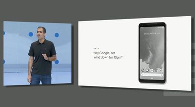
A new Wind Down mode is designed to help Android users prepare for bed. You can set a specific bed time, and when that time rolls around, Do Not Disturb will be enabled and the phone's entire interface will turn gray to discourage people from continuing to use their devices.
In addition to these features, Google is also introducing Adaptive Battery and Auto Brightness options based on personal preferences. With Adaptive Battery, an Android-enabled device predicts the apps that you'll use in the next few hours and expends battery life only on what you're going to use, restricting it from other apps. Google says testers have seen a 30 percent improvement in battery life.
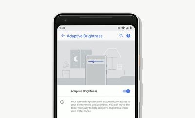
As for auto brightness, it will adjust the brightness of an Android device based on personal preference. It learns how you like your brightness settings in given places and at certain times of day and it sets it for you.
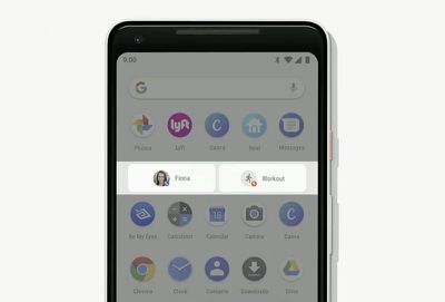
App actions are being added to predict what users want to do in an app next, offering up shortcuts (another iOS-like feature) to help users do tasks like make a phone call or send a message more quickly. Google is also introducing "Slices," a new developer API that will let "slices" of an app be rendered into various parts of the UI.
Search will be the first implementation. So when a user searches for an app like Lyft, the search results will include a slice that displays the price for the ride and allows a Lyft to be ordered without having to enter the app.
Google also announced a new ML Kit feature that's similar to Apple's recently announced CoreML machine learning API. ML Kit will let developers access APIs for barcode scanning, landmark detection, smart replies, text recognition, face recognition, image labeling, and more. Developers will also be able to tap into Google's cloud-based machine learning technologies with several ready-to-use models available. ML Kit is cross-platform and available for both iOS and Android apps.
Dozens of other features are coming to Android P, like simplified volume controls, improved notifications, better screenshots, and more, which will be outlined by Google over the rest of the week.
Android P is available in a beta capacity starting today on the Google Pixel and several other flagship devices from various companies.


