Yesterday during its F8 conference, Facebook announced that an update coming to Messenger would simplify the chat app and reduce the amount of visual clutter that had been added into the user interface over the last few years. The Next Web has shared images of this new update, showing off the cleaned up interface, a dark mode, and more.
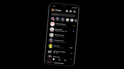
The updated Facebook Messenger greatly reduces the number of buttons on the bottom of the screen to just three, and moves the camera and call buttons to the top right of the UI. In the current app, the bottom row has five buttons for Home, People, Camera, Games, and Discover. As The Next Web pointed out, Facebook doesn't appear to be removing any features from Messenger, so anything that appears missing is believed to be combined into another button.
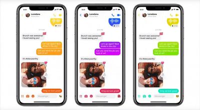
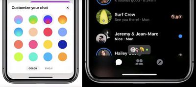
Messenger will still open on a recent chat list, with circles of friends aligning the top of the screen that includes a + button to add to your Messenger Day story, the app's Snapchat clone feature. When you click on a chat, the bottom-screen UI buttons shift to include options for chat bots, the camera, and emoji. In this screen, you'll also be able to customize your chat with various color options and set what appears to be a shortcut to your favorite emoji.
During the keynote on the update, Facebook CEO Mark Zuckerberg said that the company knows its users want a "simple and fast experience" in a chat app, so it would be "taking this moment to completely redesign Messenger to focus on these ideas." Facebook introduced a pared-down version called Messenger Lite in 2016, but it was only made available for Android devices and has yet to launch on iOS.
For the new update to the iOS Messenger app, Facebook said it's coming "very, very soon." Yesterday, the company also unveiled a "clear history" tool for ads and analytics, showed off a dating feature to rival Tinder, and launched a standalone VR headset "Oculus Go."


















Top Rated Comments