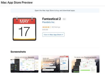
Apple recently introduced an all new design for App Store apps on the web, with a new, cleaner interface that puts screenshots and critical information front and center.
You can see the new redesigned interface by accessing or searching for any iOS or Mac app while on the web. With iOS apps, you'll see a clear notice that you need to open up the App Store to download the app, while with a Mac app, you'll get a notice letting you know you need to open up the Mac App Store.

App listings include the app's name, icon, and screenshots, along with information like star rating, ranking, purchase price and whether or not there are in-app purchases.
While an app's description used to be the first thing that came up when accessing an app on the web, it's now listed underneath screenshots, which, as 9to5Mac points out, are iPhone X screenshots. App Store webpages also include a listing of what's new, select reviews, app size, and a list of related apps.
The change to the way apps are displayed on the web comes following the launch of iTunes 12.7, which entirely eliminated the built-in App Store for iOS apps. With no App Store in iTunes, iOS apps can only be downloaded directly on an iPhone or iPad, rather than downloaded on a Mac and then transferred to an iOS device.
When making the change, Apple didn't really alter the way apps were displayed on the web, which had the potential to be confusing. The new look is much more streamlined and makes it clearer how apps can be downloaded on an iOS device.
Because of the elimination of the App Store in iTunes 12.7, some users have decided to continue using iTunes 12.6.3, which does include App Store functionality. Apple made iTunes 12.6.3 available for its educational and business customers who need iTunes to install apps, but it is also available to the general public.


