Following an op-ed shared on Axios earlier this morning by CEO Evan Spiegel, Snapchat has now unveiled its radical redesign with the goal of creating a personalized user experience that's easier to navigate, particularly for new users (via TechCrunch). The app's update will start to roll out to iOS and Android users on Friday, and will be introduced to everyone "within a few weeks."
The update aggregates both Stories and direct messages into one place, to the left of the main camera section of the app, and an algorithm sorts and prioritizes this section by "who you talk to and view most." This personalized content is now separate from premium publishers, celebrity Snapchatters, and aggregated Story events in "Discover" to the right of the camera, where Stories were located previously.
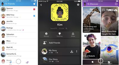
According to Spiegel, this is an attempt to "separate the social from the media" and ensure that it's simpler to keep up with your real friends and not be inundated with things you might not care about created by brands and influencers.
With the upcoming redesign of Snapchat, we are separating the social from the media, and taking an important step forward towards strengthening our relationships with our friends and our relationships with the media. This will provide a better way for publishers to distribute and monetize their Stories, and a more personal way for friends to communicate and find the content they want to watch.
The Discover area is curated by Snapchat employees but is also affected by an algorithm that will sort content based on your past viewing behavior, which Spiegel stated is inspired by Netflix's recommendation algorithms. Spiegel said that research has shown "your past behavior is a far better predictor of what you're interested in than anything your friends are doing," referencing rival companies like Facebook and Twitter.
All of this borders the camera section of the app, which you'll still see first when you open Snapchat. Navigation is made simpler thanks to icons that push you to specific sections of the app from this launch menu, including more obvious buttons for My Story, adding friends, Snap Map, and more.
The biggest change comes on the Friends page and its combination of Stories and direct messages. When you come to this area of Snapchat, you'll first see new Snaps and messages at the top, then Stories from close friends (who you watch and chat with the most), and then last will be other Stories from friends you don't interact with as much. Auto-advancing is back but with a new quality of life fix that provides a brief title screen that pops up with the name of the next friend in the queue, which you can easily swipe to skip.
Snapchat has been facing intense competition from Instagram and its own Stories feature, which it launched in August 2016. The Facebook-owned company's version of Stories quickly caught on with users and eventually managed to capture more daily active users than Snapchat in less than a year.

















Top Rated Comments
----
"Radical" redesign? They split the media content to the right to make it feel more intentional... that way people readjust to no commercial space in the friends list ... until they finally inject inline advertisements into that area.
It's no secret Snapcrap is floundering. The app becomes more and more passé.