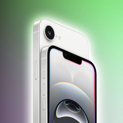
The "notch," or sensor housing on the iPhone X is the single most polarizing design decision Apple made when creating its new flagship smartphone. Some people hate the way the notch eats into the display, while others appreciate that extra bit of visible space.
Love it or hate it, the notch is here to stay until Apple finds a better way to integrate the TrueDepth camera system into its iPhone lineup. Luckily, while the notch can be disturbing at first, most people find it's easy to become accustomed to. In the video below, we explore the notch, how it affects day to day iPhone X usage, how apps are compensating, and some ways to hide it.
Prior to the iPhone X's launch, the notch sparked a lot of discussion, much of it negative, but hate for the notch has died down as people have become used to Apple's design choice.
Apple's official policy is that developers and users should embrace the notch, and as apps have implemented designs that work around it, it's blended into the background and become less noticeable in day to day use.
There are still apps that have yet to adapt to the notch, but as optimizations continue, it'll disappear even further. Here at MacRumors, we've found that the notch isn't really bothersome at all.
One exception might be landscape mode, as it's more noticeable in that orientation when doing things like browsing Safari, watching YouTube videos, and playing games. Safari browsing is getting better, though, with a new Webkit API in iOS 11.2 that allows developers to design around the notch for a better full screen experience, and in the YouTube app, if you double tap on a video, it expands to a full screen mode that's easier to watch.
For those who absolutely hate the notch, there are a couple of new apps like Notcho, designed to edit wallpapers to add a black bar to the top, effectively hiding it on the Home and Lock screen. Notcho doesn't work within apps, though, and in our opinion, hiding the notch looks worse than accepting it.


