iPhone X Owners Complain About Keyboard's 'Wasted Space' - MacRumors
Skip to Content

iPhone X Owners Complain About Keyboard's 'Wasted Space'

As early adopters began to experience the iPhone X for the first time this past weekend, many users took to the MacRumors forums, Reddit, and Twitter to discuss the gap that exists below the keyboard within iOS 11 on iPhone X. As some users pointed out, this space was likely meant as a way to more easily swipe up to go Home, and potentially for ergonomics reasons since a lower keyboard could be more difficult to type on, but many iPhone X owners are still getting used to the way the keyboard looks across all apps on the device.
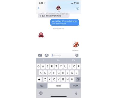
iphone x keyboard image 3

The iOS keyboard on iPhone X

On the new keyboard, the Globe or Emoji icon and the Dictation icon both sit below the space bar at the very bottom of the screen. Between these two buttons is a wide, empty gray area that isn't sitting well with some iPhone X owners, and which some early reviews of the device pointed out last week.

BuzzFeed, for example, wondered why Apple didn't do more with this space, potentially including adding "common punctuation, frequently used emojis, or literally anything."

It’s when the keyboard, in any app, is on screen (which, for me, is most of the time): There’s all this dead space on the bottom, where Apple could have put common punctuation, frequently used emojis, or literally anything, but instead left it blank. Other full-screen apps on other phones put navigation or other design elements in that area, and it doesn’t look crowded or crammed. It looks fine. It’s puzzling why Apple didn’t put something more useful down at the bottom, or why it didn’t add a row of numbers or emojis up top and push down the keyboard to make it more thumb-accessible.

Alex Muench, a UI/UX designer for apps like Todoist and Twist, went a step further and created a mockup of how this could look on future versions of iOS on the iPhone X. Muench likened this space on iPhone X to be a potential area for recently used emojis, "like Touch bar on Mac."
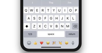
iphone x keyboard mockup alex muench

Twitter user @Yespur asked third-party keyboard SwiftKey if the company will "fill the bottom part of the screen," to which SwiftKey responded: "We'll have to look into it. Nothing to comment on beyond that." It's unclear whether third parties will have any ability to design for this area of iOS on iPhone X. In the Human Interface Guidelines for the new smartphone, the only direct mention of the keyboard asks developers to not duplicate the Globe and Dictation keys.

Don't duplicate system-provided keyboard features. On iPhone X, the Emoji/Globe key and the Dictation key automatically appear beneath the keyboard—even when using custom keyboards. Your app can't affect these keys, so avoid causing confusion by repeating them in your keyboard

The iPhone X comes with a variety of new interface gestures, features, and interactions that take some time getting used to following years of the traditional iPhone experience. Without a Home Button, unlocking the iPhone X requires you to swipe up from the bottom edge of the device, and also rearranges some physical commands like taking a screenshot by pressing the Side Button and Volume Up Button. For more information on Apple's newest smartphone, check out our iPhone X Roundup.
Related Forum: iPhone

Popular Stories

apple silicon mac lineup 2024 feature purple

Apple to Overhaul Mac Lineup With 11 New Models

Wednesday July 22, 2026 8:13 am PDT by
Apple is preparing to refresh every Mac it sells over the next two years, according to Bloomberg's Mark Gurman. The plans come amid a Mac resurgence, with sales projected to climb for a third consecutive year, partly thanks to a growing following among users who lean on the machines for demanding, agent-based AI workloads. The wave of new Macs will begin this fall with a refreshed...

iPhone 18 Pro and Pro Max Feature

'Apple Upgrade' Program Reportedly Launching Next Week

Tuesday July 21, 2026 8:30 am PDT by
Apple and Klarna are partnering on a new "Apple Upgrade" leasing program set to launch in the U.S. on Tuesday, July 28, according to Bloomberg's Mark Gurman. The program will allow you to finance most iPhone, iPad, Mac, and Apple Watch models, with a 24-month term for iPhones and Apple Watches and a 36-month term for iPads and Macs. Customers will be able to pay off the device early during...
iPhone 18 Pro Deep Red Feature

iPhone 18 Pro Launching in Two Months With These 12 New Features

Tuesday July 21, 2026 6:22 am PDT by
It is now mid-July, and that means the iPhone 18 Pro and iPhone 18 Pro Max are now just two months away. The devices are expected to look similar to the iPhone 17 Pro and iPhone 17 Pro Max, but there will still be many year-over-year changes, with rumored features including a smaller Dynamic Island, 5G via satellite, and more. Apple is expected to unveil the iPhone 18 Pro, iPhone 18 Pro Max, ...

Top Rated Comments

djcerla Avatar
114 months ago
Alternate universe headline: “iPhone X users complain about inadvertently entering symbols while using home gesture”.
Score: 54 Votes (Like | Disagree)
114 months ago
Apple is really slipping in the quality control department recently...
Totally irrelevant, uninformed comment. That would imply Apple just didn't know it looked like this. They know. And its on purpose. Try reading their Human Interface Guidelines. You're not supposed to crowd content close to the Home Bar, and precisely zero users would want them (or other devs) to do so.

Unfortunately, most "users" don't know what they want until they see it and try it. But, Apple isn't going to give you something bad just so you can decide for yourself that it was right the first time.
Score: 33 Votes (Like | Disagree)
joshwenke Avatar
114 months ago
Apple is really slipping in the quality control department recently...
Score: 19 Votes (Like | Disagree)
114 months ago
Why do we have to shove things in there? I really don't want stuff in that close proximity to the Home Bar. There's enough screen in use already.
Score: 18 Votes (Like | Disagree)
114 months ago
I saw somewhere else someone mentioned that iOS 11 is really like iOS 1 for the X. It’s a completely new device and needs a different OS than the others. These things will get worked out. I’m not taking the blame away from Apple, but I think come iOS 2 for the X (i.e. iOS 12) we will see a much improved UI.
Score: 15 Votes (Like | Disagree)
114 months ago
I think it’s fine the way it is. It’s neat and clean and doesn’t look cluttered like it does in that mock-up pic with the emojis.

The keyboard on the X is also sits in the natural position your thumbs go when holding the phone.

I do wish Apple would fix the bug that keeps changing my “I” to an A with a question mark though!!
Score: 12 Votes (Like | Disagree)