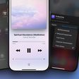
Most iPhone X owners have had barely 48 hours to get to grips with Apple's new home bar-based user interface which does away with traditional home button functions, but the general consensus is that it becomes extremely intuitive to use after just a few hours. In this article, we've gathered some neat tips and gestural tricks for using iOS 11 on iPhone X that you may not have come across.

iphonexretinadisplay
Some of the tips listed below offer an alternative one-handed approach to gestures that typically require two hands, while others simply demonstrate a quicker way of interfacing with your iPhone X that Apple hasn't made explicit in its support literature. Hopefully at least one of them will be new to you and will help you get more out of your new smartphone.

Faster App Switcher Access

Apple's Guided Tour of the new iPhone X interface would have you believe that to access the App Switcher you must swipe upwards from the middle of the home bar and then pause for a moment, before swiping along to see your open apps.

Actually there's another, faster method you can try: simply swipe up from the home bar at a 45-degree angle towards the right of the screen and then let go, and the app switcher should move straight into view almost immediately. Granted, it's a tiny adjustment to the official way of doing things, but you'll probably find it a little speedier and more intuitive.


Quit Apps Quicker

At first sight, quitting apps from within the App Switcher seems to require two fingers: one to tap-hold the app, and another to tap the app card's minus button which the first action elicits. Thankfully though, the whole process can be performed with one hand by tap-holding and swiping up on the app as soon as the minus button appears.


Reach for Control Center

Accessing the Control Center on iPhone X is completely different to how it's done on older iPhones running iOS 11. Instead of swiping up from the bottom of the screen, users must swipe down from the top-right "ear", which requires another hand. The change is a curious one, given that Apple considered locating the Control Center at the right of the App Switcher, which looks more intuitive during one-handed use. Apple could always introduce this implementation as an option in a later version of iOS 11, but until then, Reachability is your friend.


To enable the setting in iOS 11.1, go to Settings -> General -> Accessibility, and turn on Reachability. Now simply swipe down from the gestural home bar to bring the top of the interface halfway down the screen, and you should be able to swipe from the top-right with your thumb to bring down Control Center.

This method can also be used as a quick way to check your battery percentage, or to see if your VPN is connected – just a small drag from the top-right reveals the information, without you having to invoke the Control Center wholesale.

Return to Last App

Swiping the home bar to switch between apps is a smart gesture that most iPhone X owners will have already grasped. But did you know that you can perform the same swipe action from the home screen to return to the last-used app? Simply drag your thumb right across the bottom of the dock, where the home bar usually appears.


Exit App Wiggle Mode

Holding an app on the home screen makes all apps wiggle, indicating that you can now re-locate or delete them individually. With no home button to turn "wiggle mode" off, Apple added a "Done" button to the top-right on the screen. But you don't have to raise your other hand to tap it and exit wiggle mode – just swipe up from the bottom of the dock instead.


Instant Siri Search

This last one is less a new gesture, and more a combination of two, the latter of which has existed since iOS 9. Whenever you're in an app and want to do a quick search, swipe up from the home bar, release for a split second, then immediately swipe down again from the middle of the screen. (Note: this action won't work if the app you're using is located in a folder.)

This is a particularly useful swipe combo given that in iOS 11 you can now search both your iPhone and the web, with Siri offering autocomplete options similar to how it does when you perform a search in Safari. Finally, to exit the Siri Search window and return to the app you were just using, simply swipe right across the bottom of the screen.


For a screen recording of every video above in action, click here. Know of any more neat UI tricks for iPhone X? Let us know in the comments below.

Related Forum: iPhone

Top Rated Comments

sniffies Avatar
92 months ago
Here's a graphic I created showing App Switcher access in a much much faster and more intuitive and 100% consistent way. Shhh, even Craig doesn't know about it ;)

And remember:

1. No pausing
2. No L-shaped gesture
3. No r-shaped gesture
4. No whatever-shaped gesture
5. No gesture at weird angles

Simply up! Boom and you're done!


My App Switcher graphic demonstrated in video

Both hands:


One hand:


More lesser-known gestures in this thread ('https://forums.macrumors.com/threads/a-collection-of-useful-and-lesser-known-gestures-for-iphone-x-guaranteed-to-make-your-life-easier.2084829')
Score: 18 Votes (Like | Disagree)
Cpsadowski Avatar
92 months ago
These videos would of been a lot more useful, had they included fingers showing the swipes instead of plain videos.
Score: 13 Votes (Like | Disagree)
jacobh101 Avatar
92 months ago
love my iPhone X
Score: 8 Votes (Like | Disagree)
Rocketman Avatar
92 months ago
What's interesting to me about the iPhone ecosystem is it has large sociological impact. A computer in your hand and all that. But lesser considered is the changes in daily behaviour in how you interact with the device. When you have millions of people simultaneously changing habitual behaviour and in concert with each other, it gives them a sense of community of a style that has never existed before. Not religion. Not geography. Not politics. Behaviour. Discuss.
Score: 4 Votes (Like | Disagree)
hugo7 Avatar
92 months ago
The control center methods are terrible. I use the CC a lot and it seems :apple: half assed the effort.

Why not use 3D Touch in some way to invoke the CC? Or combine the CC with instant Siri search? Or at least put quick CC info such as battery %, Bluetooth, etc in the app switcher mode. :rolleyes:
Apple is basically in transition on the way to "intuitive" all screen navigation. I really wished that they broke with the current paradigm and introduced something radically new, but I guess, that would be too risky.

The home indicators gestures are a good first step, but "notification centre vs control centre" swipes are just plain awful (especially if they warrant the need for reachability). All of this non-immediate-app access needs better integration. Maybe improvements will come with iOS 12.
Score: 3 Votes (Like | Disagree)
dannys1 Avatar
92 months ago
Return to last app needs to be right at the bottom edge of the phone, quite hard to do with one hand as your thumb needs to ready down and back on itself and you have to swipe it all the way over to the right to get it to invoke or it goes back. I think I prefer going to the app switcher.

To be honest most of the time i've just swiped up and searched for the app, or used the app switcher.

I don't see the point of the red dots in the app switcher - you already have to hold to invoke the app switcher, from there it should work as normal and just let you swipe up to force lose apps. It's pretty hard to accidently invoke it so it's not like you're going to force close an app when you meant to just go home.

Also I hope Apple lets the keyboard go lower to the bottom of the screen once nearly all apps are updated to iPhone X, theres an awful lot of wasted space there catering for it to be the same level as apps that aren't updated.
Score: 3 Votes (Like | Disagree)

Popular Stories

iPhone SE 4 Thumb 1

iPhone SE 4 With Apple's Own 5G Modem 'Confirmed' to Launch in March

Tuesday November 19, 2024 12:12 pm PST by
Barclays analyst Tom O'Malley and his colleagues recently traveled to Asia to meet with various electronics manufacturers and suppliers. In a research note this week, outlining key takeaways from the trip, the analysts said they have "confirmed" that a fourth-generation iPhone SE with an Apple-designed 5G modem is slated to launch towards the end of the first quarter next year. In line with previo...
airtag purple

AirTag 2 Rumored to Launch Next Year With These New Features

Sunday November 17, 2024 5:18 am PST by
Apple released the AirTag in April 2021, so it is now three over and a half years old. While the AirTag has not received any hardware updates since then, a new version of the item tracking accessory is rumored to be in development. Below, we recap rumors about a second-generation AirTag. Timing Apple is aiming to release a new AirTag in mid-2025, according to Bloomberg's Mark Gurman....
Magic Mouse Next to Keyboard

No, Apple CEO Tim Cook Didn't Say He Prefers Logitech's MX Master 3 Over the Magic Mouse

Sunday November 17, 2024 3:03 pm PST by
While the Logitech MX Master 3 is a terrific mouse for the Mac, reports claiming that Apple CEO Tim Cook prefers that mouse over the Magic Mouse are false. The Wall Street Journal last month published an interview with Cook, in which he said he uses every Apple product every day. Soon after, The Verge's Wes Davis attempted to replicate using every Apple product in a single day. During that...
Generic iOS 18 Feature Real Mock

Apple Releases iOS 18.1.1 and iPadOS 18.1.1 With Security Fixes

Tuesday November 19, 2024 10:10 am PST by
Apple today released iOS 18.1.1 and iPadOS 18.1.1, minor updates to the iOS 18 and iPadOS 18 operating systems that debuted earlier in September. iOS 18.1.1 and iPadOS 18.1.1 come three weeks after the launch of iOS 18.1. The new software can be downloaded on eligible iPhones and iPads over-the-air by going to Settings > General > Software Update. Apple has also released iOS 17.7.2 for...
at t turbo indicator iphone 16 pro max v0 8hrh7w5f3w1e1

AT&T Turbo Indicator Showing Up in iPhone Status Bar for Subscribers

Wednesday November 20, 2024 3:42 am PST by
AT&T has begun displaying "Turbo" in the iPhone carrier label for customers subscribed to its premium network prioritization service, according to reports on Reddit. The new indicator seems to have started appearing after users updated to iOS 18.1.1, but that could be just coincidence. Image credit: Reddit user No_Highlight7476 The Turbo feature provides enhanced network performance through ...
iPhone 17 Slim Feature Single Camera 1 Redux

'iPhone 17 Air' Rumored to Surpass iPhone 6 as Thinnest iPhone Ever

Monday November 18, 2024 1:07 pm PST by
In a research note with Hong Kong-based investment bank Haitong today, obtained by MacRumors, Apple analyst Jeff Pu said he agrees with a recent rumor claiming that the so-called "iPhone 17 Air" will be around 6mm thick. "We agreed with the recent chatter of an 6mm thickness ultra-slim design of the iPhone 17 Slim model," he wrote. If that measurement proves to be accurate, there would be ...
bug security vulnerability issue fix larry

Make Sure to Update: iOS 18.1.1 and macOS Sequoia 15.1.1 Fix Actively Exploited Vulnerabilities

Tuesday November 19, 2024 10:52 am PST by
The iOS 18.1.1, iPadOS 18.1.1, and macOS Sequoia 15.1.1 updates that Apple released today address JavaScriptCore and WebKit vulnerabilities that Apple says have been actively exploited on some devices. With the JavaScriptCore vulnerability, processing maliciously crafted web content could lead to arbitrary code execution. The WebKit vulnerability had the same issue with maliciously crafted...