Christian Selig, a former Apple intern, has released a beautiful, modern, and fast Reddit client for iOS called Apollo after years of development.
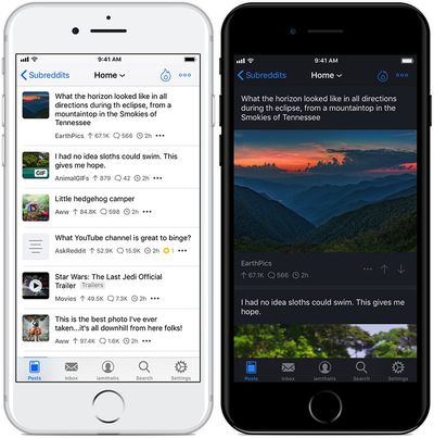
Apollo was created specifically with Apple's official iOS design guidelines in mind, with input from thousands of Reddit users for over two years. The app is very customizable in the Settings tab, where you can select compact or large post sizes, a light or dark theme, modify gestures, and much more.
The dark mode can be enabled manually, scheduled at specific times, or set to activate automatically based on your device's brightness level.
By default, the current gestures include a short swipe from the right side to reply to a post, a long swipe from the right side to save a post, a short swipe from the left side to upvote a post, and a long swipe from the left side to downvote a post. These gestures can be changed to other actions like Hide, Author, and Share.
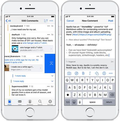
One of Apollo's key features is the Jump Bar, which allows for very quick switching between subreddits. When browsing a subreddit, simply tap its name in the top navigation bar to search for and go to another subreddit. A favorites window also appears with a list of any subreddits you have starred.
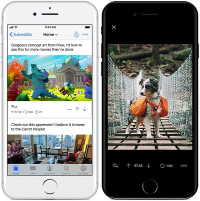
Apollo also includes an impressive media viewer for viewing, sharing, saving, or copying images, GIFs, videos, albums, and more from a variety of sources. A premium GIF scrubbing feature enables users to slide their fingers across a GIF in the media viewer to go backward or forward in the animation.
Apollo includes support for 3D Touch on iPhone 6s and later, Touch ID, and Face ID on iPhone X. The client also supports iPad natively.
Other features include a built-in Markdown composer for writing comments and posts, full in-line Imgur uploading for both images and albums, multiple account support, subreddit grouping, Safari View Controller for browsing articles and links, content filtering and blocking, direct messaging, search, and more.
In an announcement post on Reddit, Selig said he wanted to create a Reddit client that truly felt like an iOS app—not a hybrid, cross-platform one.
I really think an iOS app should look and feel like an iOS app, and an Android app should respect Material Design. I think designing for the middle results in a clunky experience where the potential of both platforms is never realized to the fullest. Apollo is an iOS app period, built to take advantage of iOS features and feel like a beautiful, familiar iOS app. I also think they discontinued Alien Blue without incorporating the best parts of it that people loved the most, such as the minimal, uncluttered UI (Alien Blue was much more compact and concise), as well as powerful features like swipe to collapse comments, full screen, inline previews for links in comments, etc. Apollo has all that and more, because I think it's essential part of browsing on iOS.
The developer also sees it as a suitable replacement for Alien Blue, which Reddit abandoned to focus on its official iOS app early last year.
Apollo is rolling out on the App Store [Direct Link] today as a free download without ads, with an optional $2.99 in-app purchase available to unlock features such as submitting posts, multiple accounts, a customizable app icon and gestures, Touch ID or Face ID authentication, and GIF scrubbing.














Top Rated Comments
If you fine folk have any questions I can answer, I'd be more than happy to! My subreddit is getting hammered with questions so obviously I'll do my best to do it in a timely manner if there are any. :)
[doublepost=1508788875][/doublepost]I totally hear you, I had notifications working in a previous build (and as a bonus they don't notify you three times a day about trending posts) but there were a few bugs I wanted to work out before adding it back in, and I didn't have time before the release. So they'll be there soon. :)
That's… really odd. Sorry! So are you registering from scratch? I'll definitely look into this and see what I can do, thank you.