Given the iPhone X's design was leaked months before it was unveiled, many people wondered how Apple would choose to approach the notch housing the device's new TrueDepth front camera and facial recognition system.
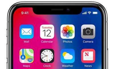
Now that the iPhone X is official, we know the answer. Apple's new human interface guidelines for the device advise developers to embrace the notch by ensuring the layout of their apps fill the entire screen.
Don't mask or call special attention to key display features. Don't attempt to hide the device's rounded corners, sensor housing, or indicator for accessing the Home screen by placing black bars at the top and bottom of the screen. Don't use visual adornments like brackets, bezels, shapes, or instructional text to call special attention to these areas either.
In fewer words, Apple doesn't want developers to hide the notch or swipe indicator by placing black bars at the top and bottom of the screen.
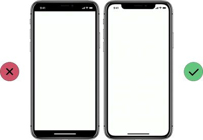
Apple says most apps that use standard, system-provided UI elements like navigation bars, tables, and collections automatically adapt to the device's new form factor. Background materials extend to the edges of the display and UI elements are appropriately inset and positioned.
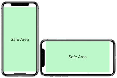
To ensure that content isn't clipped or obscured by the iPhone X's rounded display edges, sensor housing, or swipe gesture indicator, all apps should adhere to Apple's safe areas and layout margins to ensure approval on the App Store.
Apple also instructs developers not to place interactive controls at the very bottom of the screen, or in the corners, to avoid interfering with gestures such as swiping up from the bottom edge to return to the home screen.
Avoid explicitly placing interactive controls at the very bottom of the screen and in corners. People use swipe gestures at the bottom edge of the display to access the Home screen and app switcher, and these gestures may cancel custom gestures you implement in this area. The far corners of the screen can be difficult areas for people to reach comfortably.
Apple's website provides plenty of examples of how apps with system-provided elements will look, such as Messages and Apple Music.
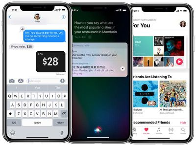
Notably absent from Apple's marketing materials are any screenshots of apps in landscape mode, aside from games, and the reason may very well be that many of them don't look as pretty in that orientation.
Using the iOS simulator in Xcode, several developers have shared screenshots of what landscape apps will look like on the iPhone X, and some of them have expressed their dismay about how they look.
As noted by developer Thomas Fuchs via The Verge, landscape orientation on iPhone X looks especially worse in Safari, as Apple has letterboxed websites by adding bars to the left and right of the screen—all to avoid the notch.
iPhone X renders webpages with literal white bars on the sides pic.twitter.com/ztcWetrLPo — Thomas Fuchs (@thomasfuchs) September 13, 2017
Apparently there is a way to set the background color, e.g. the Apple TV 4K page does it. pic.twitter.com/Am3xn6wjRp — Thomas Fuchs (@thomasfuchs) September 13, 2017
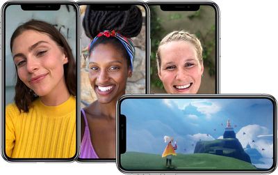
Fortunately for videos, at least, Apple automatically insets them to avoid the notch by default. A user can double tap a video to make it full screen, at which point it becomes overlapped by the notch again.
I can confirm that the "notch" at the top of the iPhone X screen does NOT cut into videos. pic.twitter.com/tdWlMqoGj3 — David Pogue (@Pogue) September 13, 2017
Meanwhile, based on Apple's size classes, iPhone X is considered to have "compact width" and "compact height" in landscape orientation.
Essentially, because of the iPhone X's swipe gesture indicator, its 5.8-inch display actually has less vertical space than the 4.7-inch iPhone 8 in landscape orientation, according to developers Sean Choe and Steven Troughton-Smith.
A number of tech enthusiasts believe Apple should have given the iPhone X's slightly larger top and bottom bezels to avoid having a notch, akin to Samsung's Galaxy S8, Xiaomi's Mi Mix 2, and LG's V30. A few Twitter users went as far as mocking up what the iPhone X could have looked like with said design.
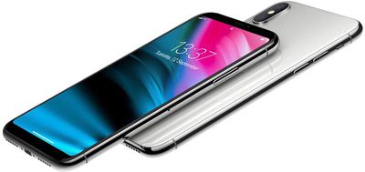
For now though, at least, the notch is the future. When the iPhone X is released in early November, we'll get our first taste of the new user experience, and many developers will certainly tailor their apps as best as possible.


