Apple's upcoming "iPhone 8" could rely entirely on gesture controls for carrying out tasks like navigating to the home screen and opening the new multitasking App Switcher in iOS 11, a new report on Wednesday claimed.
Apple has tested the complete removal of the home button – including even a virtual one – in favor of touch-based gestures, according to images of the new OLED iPhone viewed by Bloomberg and seen by people familiar with the company's plans. Those gestures are said to begin by dragging up a "thin bar" from the bottom of the screen to open the device to the home screen, where an app dock resides.
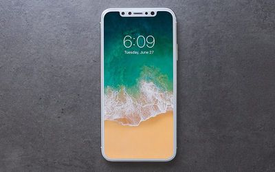
Across the bottom of the screen there's a thin, software bar in lieu of the home button. A user can drag it up to the middle of the screen to open the phone. When inside an app, a similar gesture starts multitasking. From here, users can continue to flick upwards to close the app and go back to the home screen. An animation in testing sucks the app back into its icon. The multitasking interface has been redesigned to appear like a series of standalone cards that can be swiped through, versus the stack of cards on current iPhones, the images show.
The iPhone dock will appear on the home screen in a similar way to the iPad dock as seen in the iOS 11 beta, but with six rows of up to 24 icons per screen, according to the report.
In addition to the software-based changes, Bloomberg said that the new OLED screen on Apple's "premium" handset is rounded on the corners, whereas current iPhone screens have square corners. The power button on the right side of the phone is also reportedly longer so that it's easier to press while holding the device in one hand, according to images.
Elsewhere, in perhaps a more contentious move, Apple has apparently opted not to hide the notch area at the top of the OLED screen, so a definite cutout area will be visible when using apps with non-black backgrounds.
The cutout is noticeable during app usage in the middle of the very top of the screen, where the status bar (the area that shows cellular reception, the time, and battery life) would normally be placed, according to the images. Instead, the status bar will be split into left and right sides, which some Apple employees call "ears" internally. In images of recent test devices, the left side shows the time while the area on the right side of the notch displays cellular and Wi-Fi connectivity and remaining battery life. Because of limited space, the status bar could change based on the task at hand, according to a person familiar with the testing.
Bloomberg also claims that when the display shows black, the superior color reproduction of the OLED screen ensures that it "blends in perfectly" with the notch and thin edges on the front. The screen is also reportedly flat like previous iPhones, in contrast to the fully curved displays found on Samsung's latest smartphones.
This is also interesting pic.twitter.com/JdYDhZDkev — Guilherme Rambo (@_inside) August 21, 2017
Lastly, the report adds that Apple plans to include a stainless steel band around the phone which the glass curves into. According to images seen by Bloomberg, the steel band "has small antenna cuts on the corners like past iPhones to improve reception".
While Apple often tests different designs of its products, the hardware details covered here will have been finalized long ago, although the software interface could still change before iOS 11 gets its official public release. Apple is expected to debut the redesigned OLED iPhone at a September 12 launch event alongside iterative updates to its current smartphone line-up, as well as a new upgraded Apple TV with 4K support and Apple Watch Series 3 with LTE capability.


