Google has updated its News & Weather app to bring it in line with the company's recent changes to its News website, splicing up categories to make them more focused and integrating additional navigation controls into the user interface.
First up, Google has injected more blank space into the News & Weather UI to enhance readability, and has made the headline news categories along the top of the layout more easily accessible with swipe gestures.
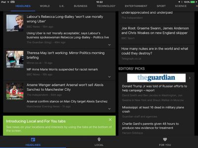
Like the Google News website, the app also now includes an always-visible navigation bar for separate "Headlines", "Local", and "For You" sections.
In Local, users can track stories from parts of the world that interest them, either by turning on location services to see news about their current location, or by manually adding a location from the relevant menu in the sidebar.
Meanwhile, in the For You section, users can input niche interests or create their own mini news feed, such as following a favorite team or tech topic, for example. Displayed topics can also be rated with the thumbs up/down icons for more personalized curation.
Google has also removed the Weekly Digest section of the app, because of low usage in earlier versions. Elsewhere, the dark reading mode and all other Google account options remain in the top left Settings menu.
The Google News & Weather app is a free download for iPhone and iPad on the App Store. [Direct Link]








Top Rated Comments
[doublepost=1499796332][/doublepost]LMAO! You're just getting this now?! Seriously?? Have you NOT been looking at all the cases in the UK against Google?! I think you've been in a time capsule.
Essentially every "story" coming out of the media is designed to mess with people's minds in some way.
This includes all the major tech news sites as well, although at least Slashdot moderators can't delete uncomfortable comments.
[doublepost=1499766811][/doublepost]It's Macrumors. how's this relevant?