Twitter today revealed a new design coming to twitter.com, Twitter for iOS, Twitter for Android, TweetDeck, and Twitter Lite over the next few days and weeks. The company said the redesign was intended to make an app that's faster and easier to use, while also fixing things that users didn't like about the current design.
The first new change is a new side navigation menu with profile, additional accounts, settings, and privacy, which Twitter said results in fewer tabs at the bottom of the app and reduces clutter. This brings all of Twitter's various apps more in line with the current iteration of the service on Android.
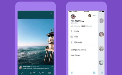
On iOS, links to articles and websites will now open in Safari's viewer within the Twitter app, which will let users easily access accounts on the websites they're already signed into. Subtler design updates include a more universal typography shift with bolder headlines and rounded profile photos. The company said that all of these visual overhauls make it easier for users to navigate Twitter and "focus on what's happening."
Last year, we told you exactly who we are (Twitter is what’s happening!) and refreshed our brand. Today, with lots of feedback and ideas from you, we’re refreshing our product too and making it feel lighter, faster, and easier to use. We listened closely and kept what you love. And for the things you didn’t, we took a new approach to fix and make better.
Hoping to make the service accessible to newcomers, more intuitive icons intend to make it easier to engage with Tweets. The reply icon (currently an arrow) will now be a speech bubble because people thought the arrow meant delete or go back to a previous page. All of the icons are now lighter, and all Tweets update instantly with reply, Retweet, and like counts (except on twitter.com and Twitter Lite) so it's easier to see updates on a Tweet in real time.
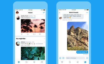
Twitter is also adding more accessibility choices, including a mode that introduces increased color contrast throughout the app. In terms of iOS-specific additions, users will be able to choose an option that always opens supported links in Safari Reader View.
The Twitter redesign will begin appearing today as an update for those on the iOS version of the app, and the rollout is planned to continue over the next few weeks [Direct Link].






Top Rated Comments
Any tweet editing functionally would have to basically do the same as editing and tweeting again to avoid that.