This week, Microsoft took the unusual step of pushing out a redesigned version of OneNote for Mac and iOS ahead of its release on Windows and Android. The update to the note-taking platform introduces a new interface that aims to enhance usability for users of assistive technologies, simplify navigation controls, and create consistency across devices, according to the company.
Microsoft said it has listened to user feedback to learn how it could improve the navigational layout of the note-taking apps, especially for larger digital notebooks with more sections. As a result, the new interface places all navigation panes in one collapsible area on the left-hand side of the app, instead of having menus for notebooks and sections/pages on either side of the window.
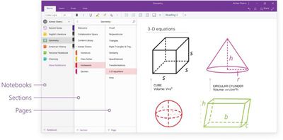
This allows users to easily switch between their notes and dramatically improves usability with assistive technologies. With the new consolidated and simplified design, screen readers can easily navigate through the app to help those with disabilities. In addition, content is front and center—helping students to focus and avoid distractions.
To switch to any other page or section, users can click its name in the navigation panes, or Control-click the name of any page or section and then choose from more options. To open a different notebook, users can click the Show Notebooks button and select it in the list, while options for creating new notebooks/sections/pages now appear at the bottom of the associated navigation panes. On Mac, each pane can also be resized by moving the mouse pointer over the vertical edge and click-dragging it.

The new design philosophy also brings greater interface consistency across Mac, iPhone, and iPad, enabling users to transition between devices quickly and easily, which Microsoft hopes will benefit those with visual impairments and also help in learning environments where device variety is increasingly common.
OneNote for Mac is freely available on the Mac App Store [Direct Link]; likewise OneNote for iOS is a free download on the App Store [Direct Link] The overhauled interface has also been applied to Microsoft's web app. Windows and Android versions are expected to roll out in the coming weeks.



















Top Rated Comments
iCloud, Google Drive, DropBox - all much, much faster.
Its the best thing to come out of MS since... forever I think.
But having a huge navigation on the left side... sort of feels off to me... Where my eyes start to read, I want my content to be. The Nav is a secondairy item of importance and should be on the right I think.
It's available on windows but not Mac.
Cloud-based notes are worthless in a corporate environment. I cannot collaborate with my colleagues being the only one on the team with a mac.