Cultured Code today officially released an all-new version of Things, the personal task manager software for Mac, iOS, and Apple Watch.
Things 3 brings an overhauled user interface and multiple new features to the to-do apps, which continue to use Things Cloud to seamlessly sync across devices.
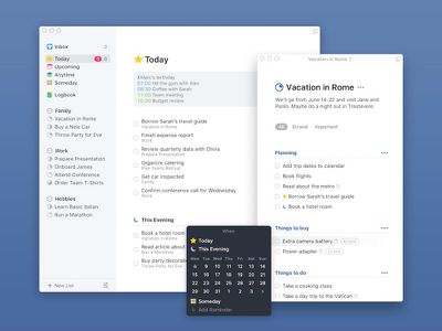
First up is the new design, offering a stripped-down look that aims to integrate the old features with the new, and put user content front and center. For example, to-dos are adaptive to their content, and can look like straight text on a piece of paper, or include additional details like tags, checklists, a start date, or a deadline. These fields also respond to a range of gestures (drag and drop, swipe, tap to expand, mark complete) to make organization easier.
Other refinements include the ability to search across the entire app by pulling down inside any list to trigger Quick Find, which offers immediate access to to-dos, lists, tags, and more. There's also a progress indicator for projects, indicating their status at a glance.
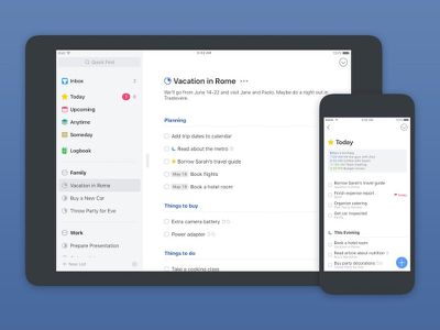
The Today and Upcoming screens have been re-imagined, and now display both calendar events and to-dos together, with events for the day shown in a timeline at the top. Every day at midnight, the next day's to-dos appear at the top of the Today list. There's also a new section called "This Evening" to make it easier to structure your day.
Things 3 also introduces headings, which can be used to break up milestones in projects and make them easier to grasp. Another new structural tool are checklists within individual to-dos, making it possible to break down tasks even further.
In addition, Things 3 features a new way to create to-dos called the Magic Plus Button. The button lives in the corner of the screen and can be either tapped or dragged up to a particular list to generate the to-do in a specific location. The button can also be used to quickly create and place headings in new projects.
Elsewhere, the iOS app now offers multiple item selection and easier list editing interactions, while the macOS version features a Slim Mode for better focus and the ability to open multiple windows with drag-and-drop support between them. Time-based reminders have also been added to the task manager, offering instant sync between devices. And a new feature called Type Travel enables fast navigation to any project, area, or to-do in the app.
Finally, the all-new Things brings an updated Apple Watch app, Wunderlist/OmniFocus import, a new structure for Areas, and Touch Bar support on MacBook Pros.
The apps will be available in the App Store as one-time purchases for Mac ($49.99), iPad ($19.99), and iPhone/Watch ($9.99). They are a paid update for existing customers, who can take advantage of a 20% discount on all apps during launch week (offer ends on May 25). A 14-day trial of Things for Mac is available on the Cultured Code website.









Top Rated Comments
I agree that Cultured Code took too long to get Things going - especially syncing. But as I remember as a purchaser of both version 1 and 2 they have given a lot. 1.5 was a free upgrade I think and was a solid update. Version 2 had various update discounts . Anyway I've given CC a fair chunk of my money and have never felt it wasn't worth the money. I don't like Omni-products in general (even I think they are over-priced) are I find the options a confused mess. CC are VERY careful with the changes they make and generally make intelligent stream-lining choices. So £80 for a todo app suite that I think is the best out there and helps me a lot - yes, I'm in. Dev's have to find a way to make money. Free apps are never really free (Think WHY Wunderlist is going to get trashed by Microsoft, in the same way Google trashed Sparrow - Money - Wunderlist was fairly special but obviously wasn't paying the bills). Do you think your Google apps are really free? - have you any idea how much Google makes from you indirectly through these apps? Subscription models are (IMO) a modern, occasionally necessary, evil - exactly how many companies are you prepared to let eat your earnings *every* month. No thanks - I like one-time price models. If I think a tool is valuable to me, and I recognise that the company cares about the product I'm far happier with a one time price.
And btw, I'm a volunteer worker who gets a small monthly stipend of £200, single room board, and community meals to be able to continue offering 'free' graphic design work to an organisation who's work and ethos I deeply value. I have no savings, and I buy second hand Apple products occasionally. My Macbook is 6 years old and still great. I will have to save for these version 3s. But I will. I like CCs dedication to a focused product and I want them to continue to make enough money from said product.
Regarding prices per platform. It is clearly easier to make more money from many sales of low priced iOS apps than Mac apps (less people buy Mac equivalents) hence higher prices are the norm for desktop class apps (which are also generally more complex and flexible in design). Not rocket science. As for the higher/separate iPad price. *Maybe* there is a point here *however* bare in mind the number of apps that can't be arsed making a proper iPad equivalent and just resize the iPhone app. I don't want that - I want an iPad version thank you. And *maybe* this is the only way the company can earn the amount they feel covers there efforts and gives them a good quality of life.
Overall it boggles me that these paid-product independent developers get this kind of response for trying to make, say, 80 bucks every few years per user. CC I believe, will offer lots of updates up to something like v3.6 and not likely be hassling me for more money for the next 2-3 years or so - *just like they did with version 2*. And people will likely complain they have gone too quite and are not offering updates enough - don't they want my money!.
So, sure I not saying I'm right, but I sure don't agree with some of the views here - and I see these view a lot when a similar product dares to try to make money on their new labour of love.
So here it is - I am a long term CC user and I have no significant complaints with their business model, product, or the value for money. I'm a happy customer and value a top end 'mere' to-do list. If anyone seriously thinks this is just like reminders (which is not free - as Apple's quality built in apps are all part of their final value placed on product) then this is clearly not for you/them.
And no - I'm nothing to do with CC. Just guy who gets a bit sick of some unchecked assumptions placed on independent developers pricing decisions. Best of luck to them and their product (not just CC).
* Making projects repeating
* Checklists in tasks for extra granularity (and perfect for when a task is literally a checklist, like shopping), and how these can be dragged around to rearrange them
* Headings in projects to allow sub-grouping tasks within projects (and how these can be dragged around to rearrange them as a group) - sort of like having a level of sub-projects but without the hassle that's usually associated with nested projects!
* The ability to drag-create tasks or projects exactly where you want them in a project or area in the main list by dragging the + button into the list
* Similarly the ability to add an item to Inbox from anywhere in the app via dragging the + to the special target
* The way multi-select is implemented on iOS, swiping on the list to enter multi-select mode, then swiping or tapping other items, or dragging down the selection circles to select a heap of tasks in one swipe, then being able to drag the whole group - which collapses into a bundle - to move it, or bulk move/delete/etc
* Gestures to do things like assign starting dates to tasks by swiping them from left to right
* Natural language input for dates and times on macOS (and it seems obvious this will eventually make its way to iOS or at least the iPad), and having all of those options in one place
* Time-based reminders on tasks (finally!)
* The ability to "filter down" when assigning something to a project, area, etc by searching, and the whole universal search throughout the apps on macOS and iOS
* On macOS this also means you just start typing anywhere, without having to do anything first, to move between different places (you can hide the sidebar completely on macOS if you want, and on iPad, and you can now have multiple lists open at once on macOS because it's full multi-window)
* This Evening granularity for Today, which I find super useful
* Ability to convert tasks into a projects (on all platforms)
* Ability to convert tasks or projects into repeating tasks or repeating projects (again on all platforms!)
* Ability to duplicate tasks (and again!)
* The obvious stuff like having the calendar events show in Today and Upcoming so you can see your tasks with your calendar items
Those are just some functional things, but I'm probably missing a lot of stuff, especially since it's the way they've implemented the finer points of everything - like the gestures, how tasks can be moved and edited, etc - that really makes it a totally new app. Lots of subtle behaviours on both iOS and macOS make it sooo much faster to use.
The amount of money they're charging might seem crazy to some people, but there's no subscription cost (unlike so many other apps now) and it's hardly anything in the scheme of other work expenses; even just thinking about software, Creative Suite's monthly charge for example. I've been using Things for 10 years, so the price of the Mac, iPhone and iPad versions has averaged out to be more than reasonable considering the years of updates and the ridiculously good sync service. It's not much money for such an extremely useful task management tool.
But the great thing about this app category is that there are so many options at so many price points (including free) that there'll be something for everyone.
Edit: typo.
Got free updates to the app during 2011, 2012, 2013, 2014, 2015, 2016 and 2017.
To me, that's not bad for $49.
Six years later, they haven't upped their price, and they haven't switched to the monthly subscription model that everyone seems to lose their head over...