Opera today showcased its first ever concept browser, codenamed Opera Neon. Built on the same browser engine as the standard Opera browser, Neon is designed to focus primarily on content.
Opera Neon includes a new user interface that consists of a start page using the user's current desktop background image, a sidebar with a video player, image gallery, and download manager, and a visual tab bar that makes it easier to switch between tabs and tell which tab is active.
There's also a built-in "intelligent system" that manages tabs, with frequently used tabs listed at the top and the less used tabs being relegated to the bottom.
A pop-out video option lets users watch videos while viewing other web pages, and a snap to gallery feature lets users take a screenshot and crop any part of a webpage, saving it for later use. With an included split screen mode, it's also possible to view two web pages simultaneously, side by side.
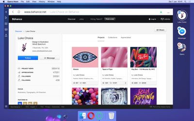
Opera Neon won't replace the current Opera browser, but some of its features will eventually be added to Opera. Both Mac and Windows users can download a free version of Opera Neon to test.










Top Rated Comments
Isn't it just a transparent window that will show ANYTHING underneath it?
I agree with everyone else, keep the focus on being a good browser and not making these bloated apps.