 Twitter has confirmed to TechCrunch that the social network is performing a small scale test for some of its iOS users, changing the popular "retweet" icon into an new "share" button. "Retweet" and "quote tweet" are now simply options to pick from within the "share" menu.
Additionally, the arrow that currently indicates a prompt to reply to a tweet has been overhauled into a small speech bubble icon. The change to the reply button is purely cosmetic and doesn't functionally alter how the feature works, but the "share" option is introducing a few new choices into the sub-menu.
In addition to the expected "retweet" and "quote tweet" buttons, when users click on "share," they are discovering new "send by direct message" and "share tweet" options. Currently in the iOS Twitter app, send by direct message is a one-tap option below each tweet represented by a small envelope, which has now been removed.
"Share tweet" lets users spread a tweet to other platforms. In its current state on the iOS app, it can be found by tapping a small, easily missable down arrow in the top right corner of the screen, after clicking on the tweet to expand it and get more information. Both the current and potentially new options bring up Apple's usual share card.

In its confirmation to TechCrunch, Twitter said that its purpose for the test is "to see how it changed behavior on the site," seemingly hoping to make it easier for users to send links to friends and family members with the new share options, boosting engagement in the process.
“We’re testing new icons on Tweets to evaluate how this impacts the way that people use Twitter,” a spokesperson said in an email.
Another reason for the change is rumored to be Twitter's acquiescence to "more established social media norms" that have been popularized by other social networks, with Twitter hoping that "share" is more recognizable and understandable by new users than Twitter-specific lingo like "retweet." In the new tests, "retweet" still exists, it's just buried under a newly named button. So if this part of Twitter's decision is true, it's still not clear why "retweet" would exist in any form within the app.
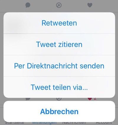
This would also fall in line with the company's decision to change "stars" and "favorites" to "likes" and "hearts," two terms Facebook users are undoubtedly familiar with at this point. The move to a speech bubble from the curved "reply" arrow might also make it easier for new users to navigate the app, thanks to its similarity to app icons like iMessages. As with the sharing option, this has the potential to boost user engagement, which Twitter has been having trouble with this year.
It’s the same reason Twitter would change the reply arrow to a speech bubble: Twitter is looking for more understandable iconography, and having too many arrows was, again, confusing to anyone less familiar with Twitter beyond very regular, existing users. Having a speech bubble icon may also prove to remind people to react more frequently, boosting engagement — a key metric that Twitter, as an ad-based service, needs to grow (especially since user growth has largely been flat).
The details of how long the test might go on for were left unspecified, but one Twitter insider also mentioned that there are "a bunch" of tests being performed at the company, so it's impossible to say which change will become a permanent mainstay for its users. Twitter has been rolling out updates to compete with the growing popularity of Snapchat and Instagram, most recently adding in live video to its mobile apps earlier this week.



















Top Rated Comments
I'm not opposed to these things, but in their current state, they're confusing and detrimental to the Twitter experience.
That's what the button should say...
[doublepost=1481910594][/doublepost]Louder!!