In iOS 10, Apple Music lost the star rating system that allowed users to personally rate a song on a scale of 1-5, which was then saved in their library so they could remember and later sort tracks via the ranking system. Following the release of the iOS 10.2 beta yesterday, iTunes expert Kirk McElhearn discovered that star ratings have returned to the Apple Music app on iOS, now appearing as a toggle option in Settings > Music.
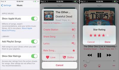
After turning on "Show Star Ratings," users will be able to once more give each track a personal rating, through a few added steps, however. The process required to get to the "Rate Song" menu is as follows: tap the ellipsis menu at the bottom right of the screen when a song is playing to bring up its action sheet, scroll down to "Rate Song," choose the star rating, then tap "Done." In prior versions of iOS, users simply tapped on the artwork of a song to bring up the star rating menu.
As the Settings submenu clarifies, "Star Ratings do not affect For You recommendations," so Apple Music's binary like/dislike system is still the only resource for subscribers to teach the streaming service which songs they enjoy, and which they don't. Besides Star Ratings, it was also discovered that within the beta of iOS 10.2, there's a new option to sort playlists by type, title, and recently added, as well as new options for sorting songs and albums by title or artist.















Top Rated Comments
-MacRumors Forum
A simple "love" and "unlove" is not sufficient for any level of sophisitcaling. Star ratings can be used to adjust the frequency that certain songs play. Not having it available on iOS has just been annoying and requires 3 party apps. It's not like the interface can get any more cluttered. Just hide it in the more info sections or just above the lyrics when you scroll up.
[doublepost=1478010227][/doublepost]Also, I wish there was an option in settings to "Hide All Clutter."
Even if you hide Apple Music, the app is so packed full of crap that it's almost unusable on the iPhone. WHy do I have to select "Downladed Music" every time I want to switch between albums and playlists when Apple Music is disabled? Why is the bottom dock so limited when it used to have 5/6 items in iOS 6 and 7!?
[doublepost=1478010311][/doublepost]It's a good thing if the feature benefits you, a bad thing if it doesn't. ;)
All kidding aside, the allure of iOS was simplicity, but that's hard because people's are so different. THere needs to be a balance, but I fear that Apple is approaching too much.
[doublepost=1478010400][/doublepost]I can attest that Apple Music was made for large screens. I can tolerate it on my 9.7" iPad, but it's horrible on my iPhone SE. I jumped to Cesium. It's a shame though because I thought that the release of the SE would mean Apple would optimize for all sizes again.