Apple provided the media with demo units of the new MacBook Pro sans Touch Bar, and a handful of websites have now published their early thoughts and first impressions about the 13-inch notebook. The articles reveal some interesting tidbits beyond yesterday's Touch Bar model hands-on and first impressions roundups.
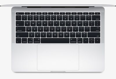
While the new MacBook Pro's keyboard is a controversial topic, with some users preferring Apple's traditional scissor design, most reviews said Apple's second-generation butterfly mechanism offers an improved typing experience compared to the 12-inch MacBook's first-generation butterfly keyboard.
Brian Heater of TechCrunch said the keyboard "feels more natural" and that individual keys have "better give":
The new technology certainly marks a step in the right direction. The process feels more natural, and the keys have better give. I still prefer the tactile feel of older keyboards, but a lot of that may just have to do with familiarity. After all, the device was only announced yesterday.
Jim Dalrymple at The Loop echoed that sentiment, noting there is "a little more travel distance when you press down on a key":
It seems to me that there is a little more travel distance when you press down on a key with the newer keyboard. I actually like that a bit better. After using both, the MacBook keys didn’t have enough travel. This one feels much better to me.
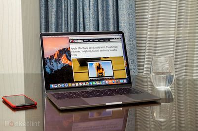
Stuart Miles of Pocket-lint said the new keyboard is sandwiched between "louder, clearer, and cleaner" speakers with bass-heavier sound:
The keyboard is now sandwiched between two speakers that run the height of the keyboard and deliver a louder, clearer, cleaner noise which is considerably more rounded and bassy than the previous outings. That's achievable because Apple has changed the speaker technology moving away from bouncing the sound off the display, instead placing the direct firing speakers either side of the keyboard.
Likewise, Heater said the speakers deliver richer sound than before, noting that "things get loud. Really, really loud."
They’re good for casual listening and maybe an episode or two of a TV show. Anything longer than that, I would go with a pair of headphones or Bluetooth speaker. Also things start to deteriorate when things hit top volume.
Dan Ackerman at CNET said the new non-Touch Bar MacBook Pro might be "the new default MacBook for most people," although its price is disappointing:
Meanwhile, Andrew Cunningham at Ars Technica highlighted the new MacBook Pro's brighter display and wider DCI-P3 color gamut:
Both screens are 2560×1600 and 227 PPI, the same resolution and density as the old design, though the screens are brighter and support the DCI-P3 color gamut, which is increasingly becoming the norm for Apple’s devices.
Cunningham added that the new MacBook Pro scales to 1,440×900 pixels out of the box, which makes it look like it has a higher screen resolution:
The new 13-inch MacBook Pro support four display scaling modes: 1024×600, 1280×800, 1440×900, and 1680×1050. The old Pros used the 1280×800 mode out of the box, which just happened to match the display’s native resolution. The new Pros use the 1440×900 mode out of the box, which means they look like they have a higher screen resolution even though they don’t.
Cunningham said making comparisons between the new MacBook Pro and MacBook Air is "understandable but flawed." He argued "it's only really a comparison that works when all else is equal," which is not the case given the new MacBook Pro is upwards of $500 more expensive than the remaining 13-inch MacBook Air.
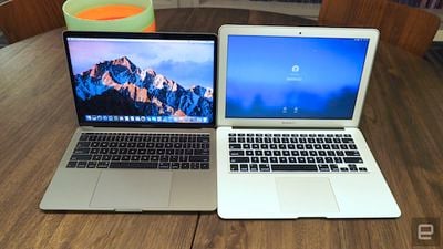
Dana Wollman at Engadget applauded the new MacBook Pro's smaller footprint, particularly compared to the MacBook Air:
Let's start with the design: Holy moly, is this thing small. I noticed it right away, just because my normal work laptop is a MacBook Air, which means I'm used to something much larger than this. The difference is especially obvious if you stack one machine on top of the other. Though both have 13.3-inch screens, the new MacBook Pro has a much smaller footprint — it's shorter and less wide. Truly, trimming down that humongous bezel from the Air makes a world of difference.
One aspect of the new MacBook Pro often criticized is its lack of ports. The non-Touch Bar model has only two Thunderbolt 3 ports, which carry power, USB, DisplayPort, HDMI, and VGA for video out over a single port. As with the 12-inch MacBook, customers will have to purchase adapters to connect certain devices and accessories.
Steve Kovach at Business Insider said the need for "a lot of dongles" is "the most frustrating thing" about the new MacBook Pro:
If you want to use older accessories or even charge your iPhone, you're going to need to buy a separate adapter or brand-new cable. That's going to be super annoying for a lot of people as the industry continues to shift to USB-C. For example, the cable that lets you charge your iPhone in the MacBook Pro will cost you $25. Yikes.
The new MacBook Pro is also expensive, although the non-Touch Bar model is slightly more affordable at $1,499. The non-Touch Bar model is currently available for pre-order and ships in 1 business day. Touch Bar models start at $1,799 and $2,399 for the 13-inch and 15-inch models respectively and ship in 4-5 weeks.


