Case designs, drawings, and renders for the "iPhone 7" and "iPhone 7 Plus" have been propagating online for several months now, with most agreeing that the 2016 smartphone will adopt the same design language of the iPhone 6s. Apple is still expected to introduce a few new exclusive features on this year's iPhone, possibly including a Smart Connector, dual-lens camera, redesigned antennae bands, and no 3.5mm headphone jack.
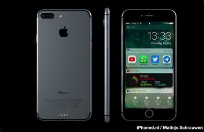
Some of these additions -- mainly the dual-lens camera -- are rumored to be solely found on the iPhone 7 Plus, while the existence of others are still debated as we move closer to September and the expected reveal of each handset. Today, designer Mathijs Schrauwen (via iPhoned) [Google Translate] has imagined these rumors into an iPhone 7 rendering, alongside the newest information coming out of WWDC regarding the feature-packed additions of iOS 10.
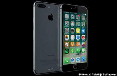
Schrauwen's designs show off the expected dual-lens camera system of the new iPhone, housed inside a small pill-shaped enclosure along with a horizontally aligned flash. The back also honors the rumor that Apple will realign the antennae bands from the current design, which cut across the back of the iPhone. The designer went for a Space Gray look, contrasting recent, questionable rumors that Apple might ditch the color in favor of a kind of "Deep Blue."
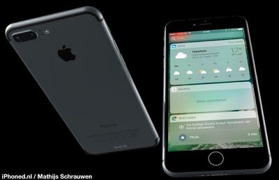
Thanks to iOS 10's nixing of the "Slide to Unlock" feature, placing more emphasis on Touch ID than ever before, Schrauwen also includes a touch-sensitive Home Button in his renderings. This falls in line with recent sketchy reports that the iPhone 7 could possibly be the first iPhone model without a physical Home Button.
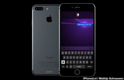
The back of the new design renders double down on the Smart Connector rumor that is one of the more contested reports for the iPhone 7 and iPhone 7 Plus, with the earliest rumors saying it was coming in 2016, and newer ones contradicting that news. iPhoned also alleges that Schrauwen's designs remove the 3.5mm headphone jack, which is one of the more widely believed rumors, but none clearly show the bottom of the device.
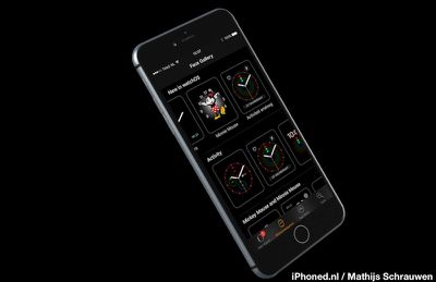
Besides the hardware specifics, the renders are interesting insights into what a new generation iPhone might possibly look like running iOS 10. Schrauwen depicts screens running apps like Watch and Messages, and performing basic duties in the new widgets view. Instead of a downward swipe to access widgets in Notification Center, iOS 10 places them on the left-most screen of both the Lock screen and Home screen.
There's been a lot of news surrounding iOS 10 and all of its new features coming out of WWDC this week, with new details on apps like Messages, Photos, and the nuances of the redesigned Lock screen getting heavy attention. You can catch up with all the news you may have missed in the MacRumors iOS 10 tidbits post, and check out our most recent video, centering around the robust additions to Messages.












Top Rated Comments